Showing posts with label Text Effects. Show all posts

Monday, June 14, 2010

Pressed Text Effect

I have launched a New Blog :)

http://www.blog.kailash.me

All original tutorials with source file for free.


Final Result.


Step 1

Create an New document. Click on File > Select “New” Or Press keyboard shortcut “ctrl + n”

New photoshop document

Step 2

Now fill the background layer with ” #4f9ec7 ”

Step 3

Choose ” Type Tool ” then type any text on the document with black as the text color, In this tutorial i have used “SF Quartzite” font Bold. If you would like to have the same font you can download this click here

Step 4
Layer Style – Right click on the text layer select “Blending Option”
1. Drop shadow – Make changes as per the below screen shot.

2. Inner shadow – Make changes as per the below screen shot.

3. Gradien Overlay – Make changes as per the below screen shot.

4. Pattern Overlay – Make changes as per the below screen shot.

Final Result.


Download PSD Source File


==============================
====== For more tutorials keep visiting ;)
==== http://photoshop-manic.blogspot.com ==================================

Adobe Photoshop Training - Photoshop Classes -Photoshop Tutorial - Photoshop Seminars - Photoshop CS3 - Photoshop CS4 - Photoshop 7 -Photoshop Tutorial Downloads - Lots more :-)

Thursday, March 12, 2009

Glow Effect TXT

Step 1 – New Document

Create a new document:-

Height of 5 inches
and width of 7 inches. Best way to do this is against the photo paper you will be using.
Resolution: 300 (or just 72 for the purpose of playing)

Step 2 – Gradient

Using a large brush, with a soft edge, select a colour you would like for your door sign and slightly off to the left, apply a single brush stroke/dab.

Student Door Sign Text Effect

I’ve chosen #993300 for the purpose of this tutorial, giving us a deep musky setting.

Step 3 – Texture

In a new layer above, set your colours back to black/white and apply clouds ( Filter > Render > Clouds ).

Set the entire layer to overlay mode and bring down the opacity to around 34 - 50 percent.

Student Door Sign Text Effect

Step 4 – Our First Glow

Select the pen tool and draw a wavy line with maybe four or five anchor points.
If you need some further guidance using the pen tool, there are a plentiful supply of tutorials around the internet. Like this one, or this one ;)

Student Door Sign Text Effect

Once you have drawn your path, create a new layer and select your brush with white. Making sure you have a hard edge set on your brush, apply a few strokes until you find a suitable size for your path. Once you are happy, delete the current brush strokes and switch back to your pen tool. Right click on your path and select ‘Stroke Path…’ find Brush in the drop down and check ‘Simulate Pressure’.

Student Door Sign Text Effect

Click OK..

Student Door Sign Text Effect

Apply the following layer style properties to achieve a nice even glow around your lines.

Student Door Sign Text Effect
(click to enlarge)

Repeat this step on a new layer until you have some sweeping lines you are happy with.

Step 5 – Additional Details

If you have a few glowing lines that cross, rastorize each of the layers still keeping them separate. You can do this by creating a new layer above, right click on the new layer and select ‘Merge Down’.

With a white brush, half opacity, apply some strokes where ever your lines cross. This will just give the appearance of reaction where they touch and give your door sign a little more energy.

Step 5 – Insert Your Name!

Finding a font that suits you and your design, type in your name.

Student Door Sign Text Effect

Copy the layer properties from one of the lines previously with an additional layer style of ‘Color Overlay’, selecting a colour close to the glow of one of your lines and lightening this slightly in the colour picker. This will just take away from too vibrant and stark a white.

That’s you! Finished. Just print it out and stick it up!

Student Door Sign Text Effect


NOTE : ALL CREDITS FOR THE ORIGINAL TUTORIAL MAKER :)


=================================
=== For more tutorials keep visiting ;) ===
= http://photoshop-manic.blogspot.com =
=================================

Sunday, March 8, 2009

Lovely Love Txt Effect :P

Step 1

Start by creating a new file (File > New or Ctrl+N), and make it 1024 pixels wide and 1280 pixels high, with 72 pixels/inch. Name your first layer ‘BackGround’ or ‘B’ and select the gradient tool (G). Click on the ‘gradient’ on the top to edit, make sure you also have selected radial gradient and use the colors shown in the image below (#fad841 and #86575b). Drag the gradient from the middle of the canvas to the corne

Step 2

Now a brick texture will be added, for a very subtle effect. In our final image, we want love to come ‘break through’ and the slight visible brick wall will add to this effect. For example this brick texture, found on cgtextures.com. Download the large version and place it in an appropriate way in the document, and name it ‘bricks’. Desaturate the texture (Image > Adjustments > Desaturate or Shft + Ctrl + U ), and apply the following filters:

After applying the filters, set the Blend Mode of the Layer on Overlay and add a Layer Mask. This Layer Mask will allow us to (partially) show or hide something from this layer. By brushing with black in the Layer Mask, these area’s will be invisible, and using white will make them visible again. This is better as the Eraser Tool, as it allows us easily to adapt the layer if we removed too much.

Brush (B) with black (#000000), with a soft edged brush sized around 500px (press { or } to increase the Brush Size while having the Brush Tool selected), mostly in the middle in your Layer Mask (make sure you selected your Layer Mask and not the Layer itself!). Set the Fill of the ‘Bricks’ layer around 10-25%, depending on how much you want the brick layer to be visible. In the image below you can also see what parts of the layer mask I brushed black.

Step 3

Still having the Brush Tool, 500px Soft Edge and black color, selected, make a new layer and name it ‘Dark Border’. Lower the Opacity of your Brush Tool to 25% and carefully start brushing in the corners and borders, until you have something like this:

Step 4

We are going to use a pattern, but it has to be defined first. So open up a new document (Ctrl + N ), 450px wide and 150px high, and make sure it has a transparent background. Select the Type Tool (T), use the font Gill Sans MT, bold with strong anti-aliasing, color white (#ffffff) and use a font size of 144pt. Type ‘LOVE’ (so with capitals), and place this word exactly in the middle (using the Move Tool (V)). Go to Edit > Define Pattern and choose a suitable name, and hit ok.

The pattern is ready, now make a new layer in the document we’re already working in, and name it for example ‘Pattern’. Select the whole layer, using the Rectangular Marquee Tool (M), right mouse on your select and select Fill. Choose the pattern you just made, keep the Opacity at 100% and the Mode on Normal. After filling the selection with the pattern, rotate the whole layer about -45 degrees using Free Transform (ctrl + T).

A Layer Mask will be used again for hiding some areas we don’t want to see. Add a Layer Mask and draw a (black foreground and white background) Linear Gradient in the middle. After this, set the Blending Mode of this Layer to Overlay and lower the Fill to 3% (or a little bit higher, if you want it to be more visible).

Step 5

Now some more font will be added. This wallpaper was based on a song, so I took some of the lyrics, but of course you can add something very inspirational of your own : )! As you can see below you can make three lines of text, also using slashes. This can be done either by using enters and spaces or using multiple text layers. Use Gill Sans MT, bold, 36 pt and Smooth anti-aliasing. The color of the slashes is #ff2400 and of the text #ffffff. Finally lower the Fill of this / these layer(s) to 50%.

Step 6

Now it is getting more lovely! Add a New Layer (ctrl+ shift + N), go to the custom shape tool, and choose the heart shape. Make sure you selected the heart shape and ‘Shape Layers’ is selected. Now draw a heart in the middle, which covers the complete middle (as shown in the second picture below). Change the color of this shape layer to #33153e and set Blending Mode to Overlay. Now go to the Blending Options of this layer (right mouse while hovering layer > Blending Options. Add Inner Shadow, settings are shown in the image below): Now you should have something like this:

Step 7

Now we arrived at the final part of this tutorial, we already have a decent background, but now the render will be added. Download the render here: .psd or .png. Place the render in the middle of the document, make sure it is the top Layer, name it ‘Render’ and duplicate it 2 times. Hide the top ‘Render Layer’ (by clicking on the ‘eye’ next to the Layers), as this one will be used later.

Select the (unhidden) layer and apply Flip Vertical (Edit > Transform > Flip Vertical). Drag this layer to the bottom, using the Move Tool (V). Add a Layer Mask to this Layer, draw a black (foreground color) to white (background color) Gradient in the bottom of this Layer Mask and set Fill of the Layer to 25%.

Step 8

Unhide the next Layer (Render Copy), so the Layer above the ‘Render Layer’ in Step 7. This layer is still in the middle, if you did everything right, and we don’t need to move it. Observing the layer, we see some ‘blocky’ parts of glow around the Render, which could be softer. Add a layer mask, and in this Layer Mask using a Black Soft Brush, with Low Opacity (25%), erase the unwanted parts of the render.

Step 9

Make a selection of the layer used in Step 8, by doing Ctrl + Click on the Layer. Add an Adjustment ‘Curves’ Layer by going to Layer > New Adjustment Layer > Curves, or by using the Icon in the Layers Panel. Use a curve similar as shown in the image below, and apply it. Because we selected the render first and then added the Adjustment Layer, the Adjustment Layer will only apply to the selection. This will result in making the render more bright.

Step 10

Duplicate the ‘Render Copy’ Layer (the Layer from Step 8), so we don’t have to do the erasing in the Layer Mask again, as the Layer Mask will also be duplicated along. Move this layer above the Adjustment Layer we added in Step 9. Set the Blending Mode of this Layer, ‘Render Copy 2′, to overlay. Apply the Find Edges filter (Filter > Stylize > Find Edges). Now the image will look like this:

Step 11

The image still looks somewhat flat, so perhaps we could add some more light in the middle. Add a new Layer (Ctrl + Shift + N), name it for example ‘Light’, and draw a oval as big as the heart using the Elliptical Marque Tool (M). Fill this, by using the paintbucket (G), with a light gray color, for example #d4d4d4.

Now apply Gaussian Blur to this layer (Filter > Blur > Gaussian Blur), using the following settings:

Finally set the Layer’s Blending Mode to Overlay, and you should now have something like this:

Step 12

It already looks good, but still a bit dull, and not enough into the essence of the image. It should be somewhat stronger. Thus the last thing we need to do is to add some more red color. Add a Color Balance Adjustment Layer (Layer > New Adjustment Layer > Color Balance or use the icon in the Layers Panel), and use the following settings:

Finished!

Congratulations, you finished this tutorial and you’ve managed to make a lovely wallpaper. The outcome should be something like the image below:


NOTE : ALL CREDITS FOR THE ORIGINAL TUTORIAL MAKER :)


=================================
=== For more tutorials keep visiting ;) ===
= http://photoshop-manic.blogspot.com =
=================================

Tuesday, February 3, 2009

Funky text poster

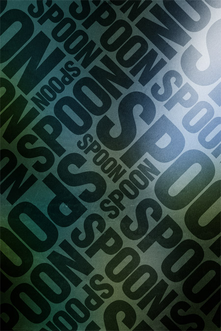
Using simple shapes can produce some great looking contemporary designs that fit well as impactful posters, a good example being the recent Trendy Geometric Lines tutorial. This time we’ll look at stripping back the tools to creating an interesting and eye-catching poster with a single typographic word.

typographic poster design

typographic poster design

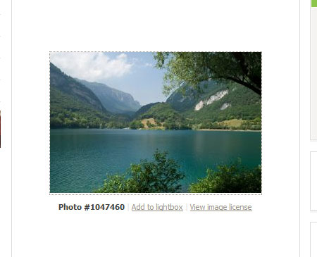
Find a random image to base the design on, the subject of the photo isn’t at all important, just choose a picture with varied contrast and preferably tailored towards your chosen colour scheme. In this case I’ve picked out a landscape scene with a mix of blues and greens.

typographic poster design

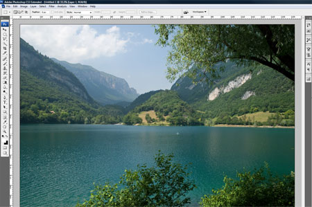
Open up the image in Adobe Photoshop and resize accordingly.

typographic poster design

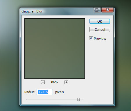
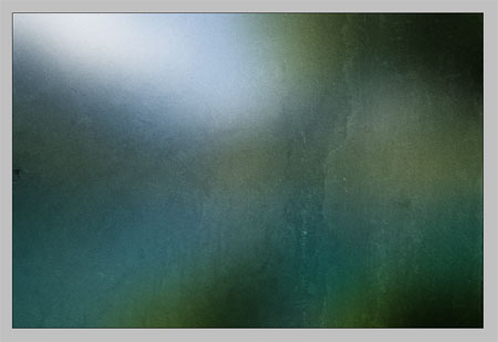
Go to Filter > Blur > Gaussian Blur, drag the slider almost all the way to the maximum to completely disguise the original subject and blend together the colours and tones.

typographic poster design

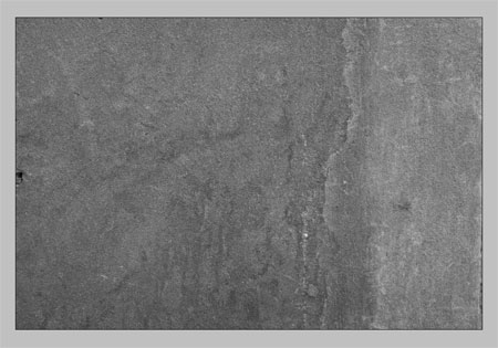
Head over to the fantastic Bittbox.com and download one of the free high-res textures. Place the texture on a new layer in the Photoshop document.

typographic poster design

Desaturate the image then change the blending mode to Soft Light and drop the opacity to suit, adding a little detail and roughness to the image.

typographic poster design

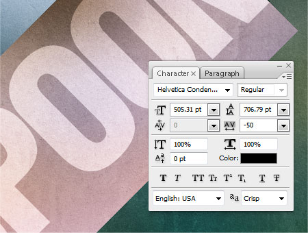
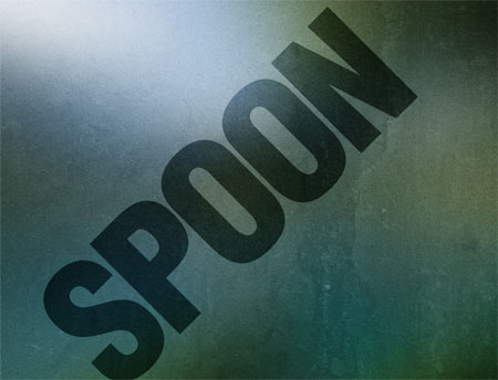
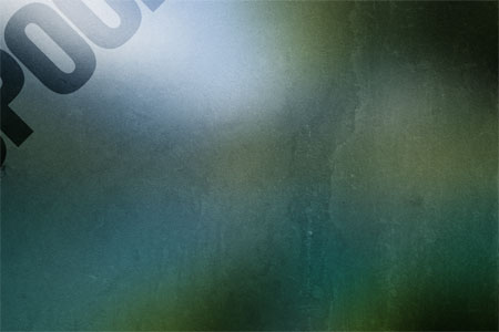
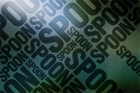
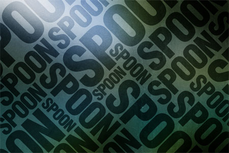
With the Type Tool, write out your desired wording. Of course, I have used the word SPOON and set in the bold and prominent Helvetica Condensed Black.

typographic poster design

Rotate the block of text to 45 degrees (hold shift to constrain the angle). Set the blending mode to Soft Light to allow the underlying texture to show through.

typographic poster design

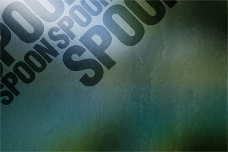
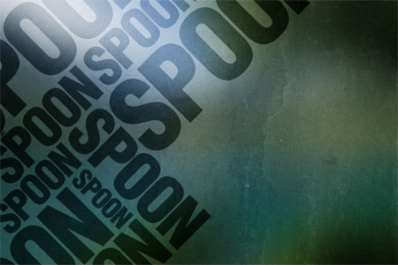
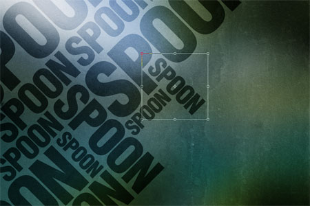
Position the text to encroach onto the document covering the top corner. Whilst holding ALT drag a copy of the text and scale into a new position.

typographic poster design

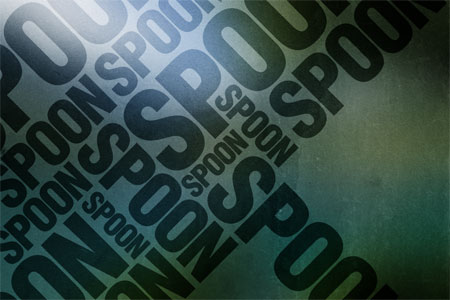
Hold the ALT key and drag two more copies of the text, resize them and position to fill out space on the document.

typographic poster design

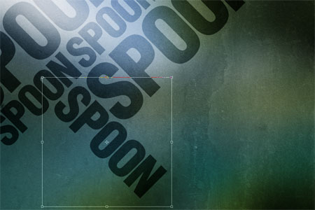
With the next copy, rotate the text by 90 degrees leaving it perpendicular to the other variations. Move the text into place leaving the same gap between the other text objects.

typographic poster design

typographic poster design

Create more instances of the text and rotate and scale into varying positions, ensure that each block aligns to the diagonal gridlines of the composition that are being formed.

typographic poster design

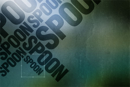
When gaps appear in the document, visualise how the word can be scaled or rotated to fill the gap whilst aligning to the gridline and leaving the same gap around the objects.

typographic poster design

typographic poster design

typographic poster design

Also take into consideration the spread of large and small instances of the text to ensure that the sizes are varied without clusters of similar sized objects creating an unwanted focal point.

typographic poster design

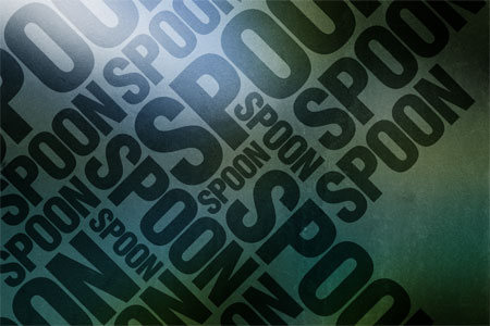
With multiple copies of the text being scaled and rotated into place the document is now completely filled.

typographic poster design

Make any final tweaks to the poster such as altering the overall layout and making small edits to the individual objects, leaving a trendy poster design based almost solely on a typographic layout of a single word!


NOTE : ALL CREDITS FOR THE ORIGINAL TUTORIAL MAKER :)


=================================
=== For more tutorials keep visiting ;) ===
= http://photoshop-manic.blogspot.com =
=================================