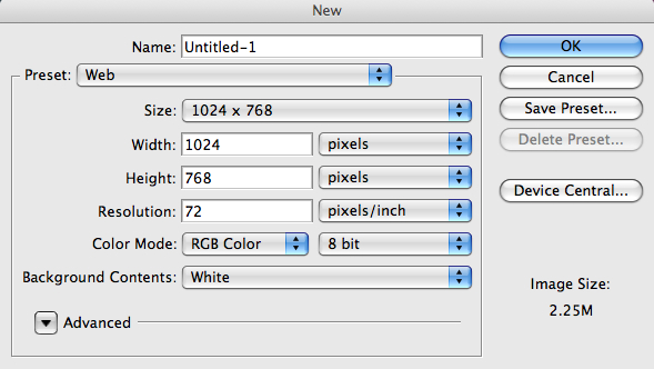
Step 1
Create a new document using the settings shown below. You can actually use whatever resolution you choose, in this tutorial I used 1024x768.
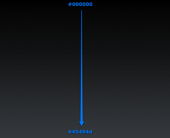
Step 2
Grab the Gradient Tool, select Linear Style and fill the layer from top (#000000) to bottom (#45494d).
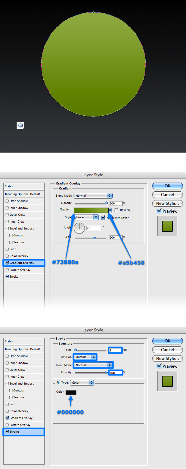
Step 3
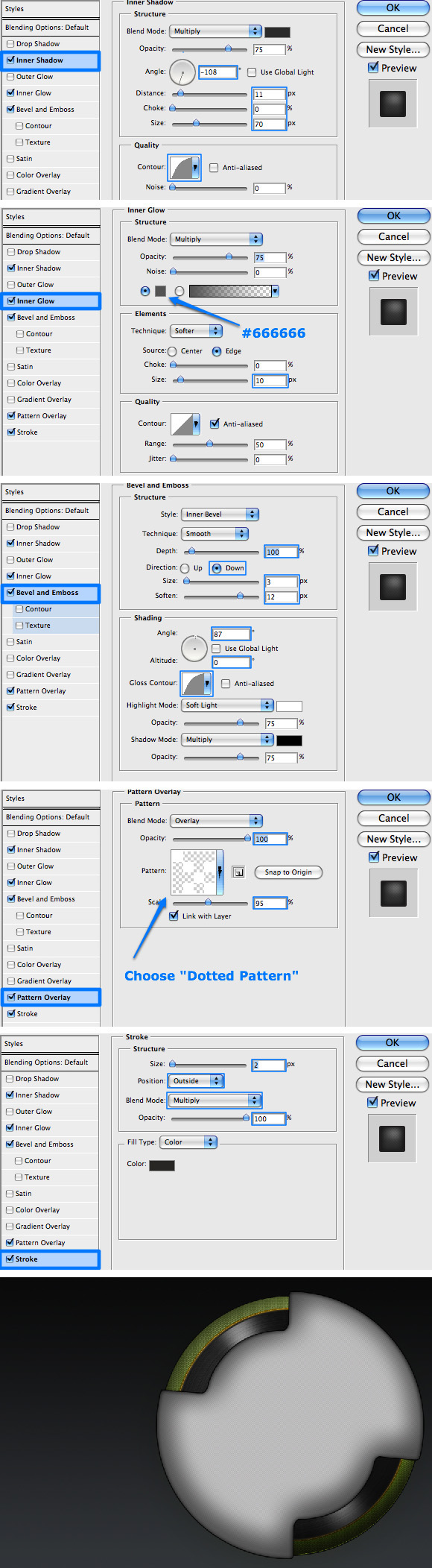
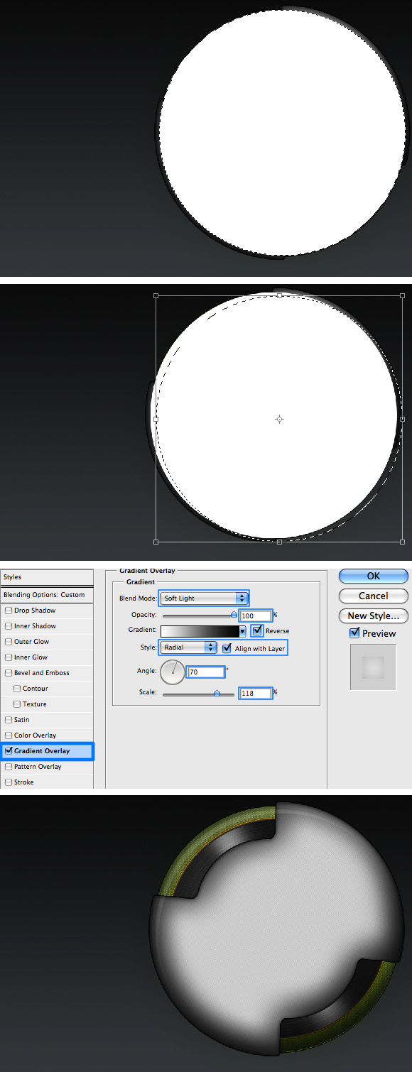
Select the Ellipse Tool (Shift + U) and draw a circle. Rename the layer that was just created "Player_L1" and apply a Gradient Overlay and an outside Stroke, using the settings shown below.
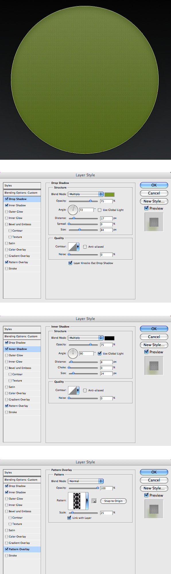
Step 4
Next, we will add a nice pattern to this layer. Since you cannot have pattern and a gradient styles applied to the same layer, duplicate the layer and rename it "Player_L1_Pattern." Change the layer's Blending Mode to Multiply with 40% Opacity and apply the layer styles that are shown below. I have used a very cool "Spiderman" pattern by
*s0nkite which you can download from
here.
Step 5
For the next step you will need to create a vinyl record. A nice tutorial by
Arik on Creating a Vinyl Record In Photoshop that will show you how to do it.
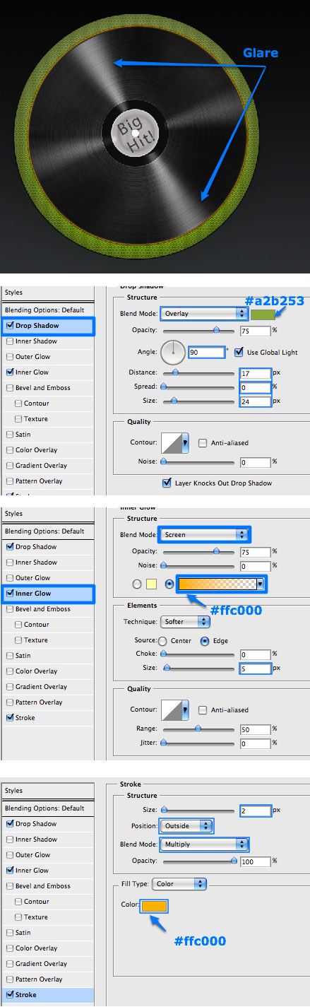
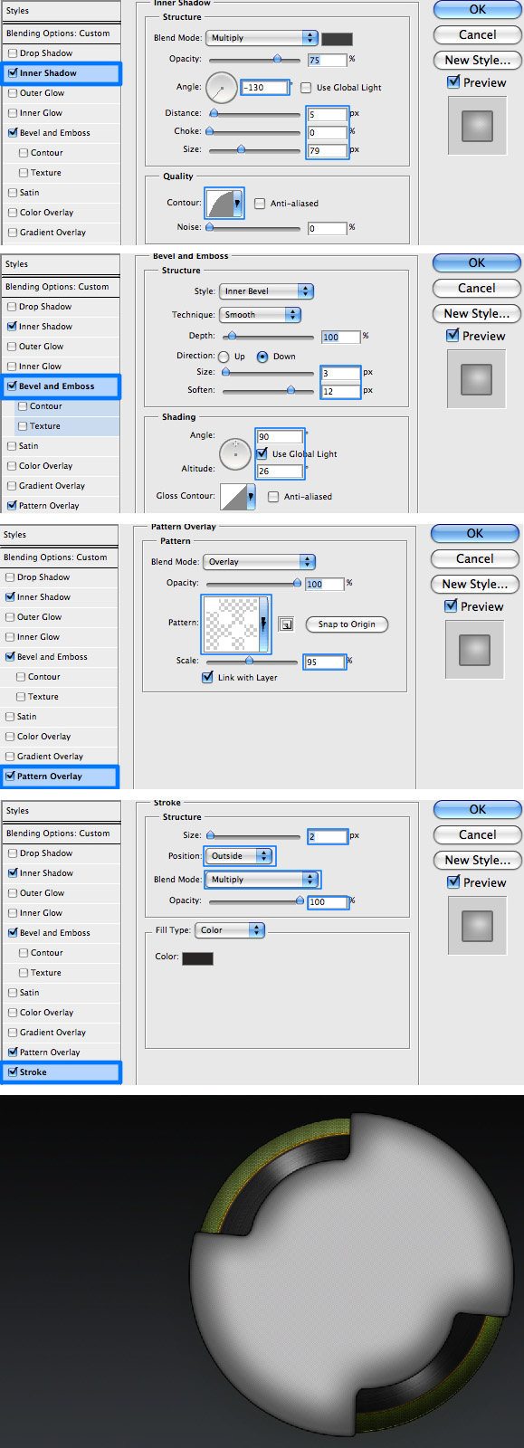
You can follow Arik's tutorial, creating the record in this design, simply without the background. Once you have the record done, merge all its layers and rename the merged layer "Player_L2." Apply the following layer styles and also make sure to rotate the record so that its glare will be positioned as shown.
Step 6
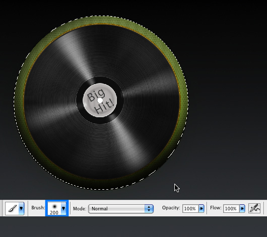
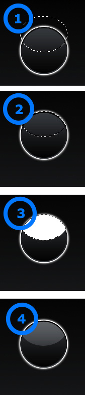
Create a new layer and rename it "Player_L12_Shade." While still on this layer, Command-click the "Player_L1" layer to select its shape. Make sure you have selected black as your Foreground color, grab the Brush Tool (B) and using a 200px soft rounded brush gently add some black shading working your way from outside the selected area. Make sure you only color the bottom, as that is the only area that requires shading for now. Change the layer's blending mode to Multiply with 80% Opacity.
Step 7
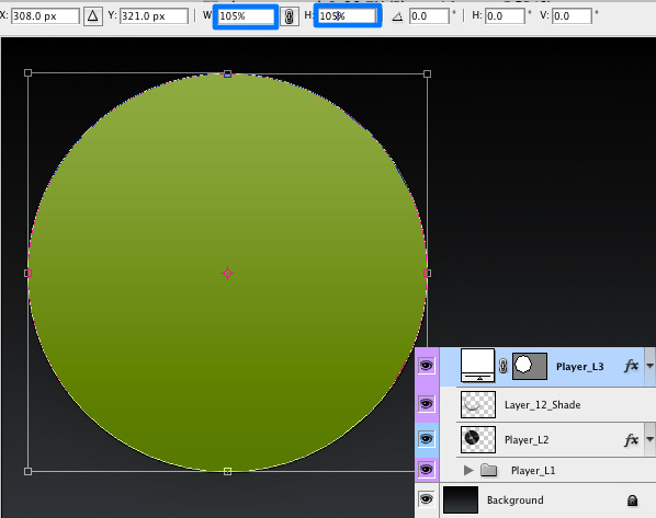
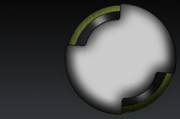
Duplicate the "Player_L1" layer and place it on top of all other layers. Name this layer "Player_L3." Hit Command + T to transform the shape. We will increase its size by 105% as shown below.
Step 8
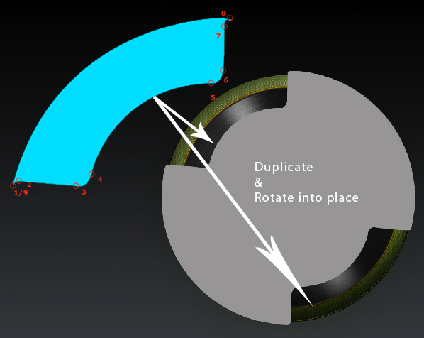
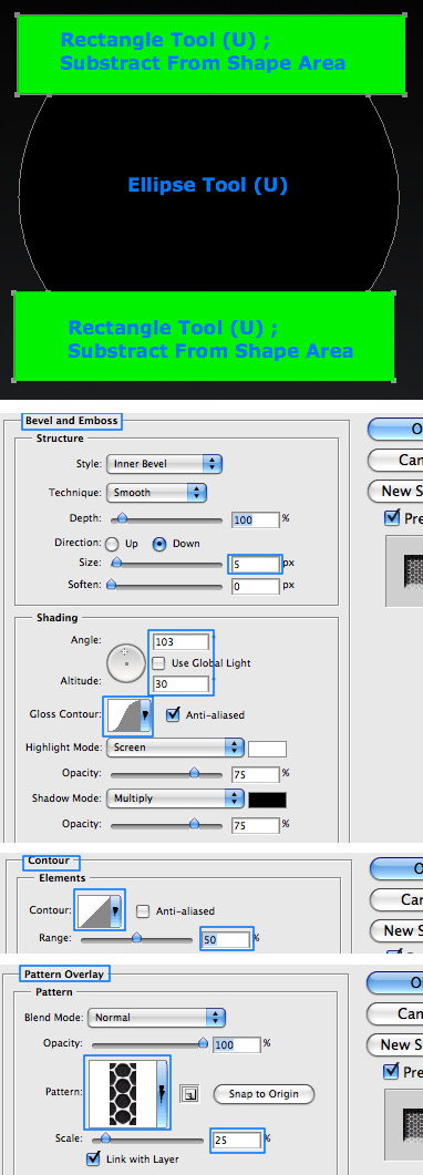
Next we need to
carve into the newly created circle. In order to do this, click the "Player_L3" layer, grab the Pen Tool (P) and select Subtract From Shape Area (-). Use the Pen Tool to draw the shape as shown below.
Once the shape is ready, grab the Path Selection Tool (A) and select the shape you have just created. Alt-drag the shape to duplicate it, choose Edit > Transform > Rotate and rotate the duplicated shape until it is in the right angle to be placed opposite to the original one.
Step 9
We will now create a pattern, which we'll use to pop up our design a bit. Create a new file (File > New) with the following settings: size of 4px by 4px, resolution of 72 dpi, and a transparent background. Grab the Pencil Tool (B) and adjust the size to 1 px, then create the following pattern using a white color (you may want to zoom in so that the drawing will be easier). Once you are done drawing the pattern, choose Edit > Define Pattern and name it "Dotted Pattern."
Step 10
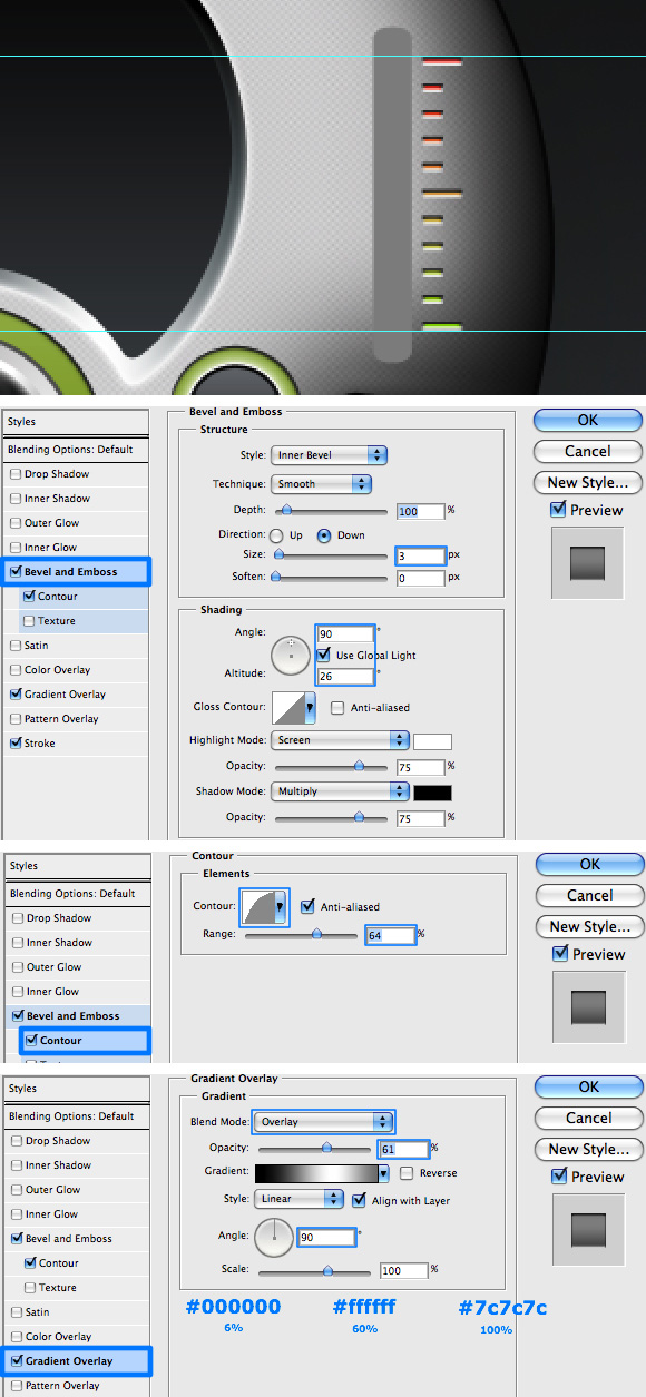
Double-click on the "Player_L3" layer and apply the following layer styles.
Step 11
Duplicate the "Player_L3" layer and name the new layer "Player_L3_2," also change the layer's Blending Mode to Soft Light with 50% Opacity. Double-click this layer to apply the following layer styles.
Step 12
Create a new layer and name it "Player_L3_Shade." While still on this layer, Command-click the "Player_L3" and add some shading to the right and bottom sides of the selected area (the same way as we did in Step 6).
Step 13
Now we will add a small glare to the player's body. Create a new layer and name it "Player_Glare." While on this layer, Command-click the "Player_L1" layer to select its shape. Fill the selected area with white and de-select the layer (Command + D).
Select the contents of "Player_Glare," choose Select > Transform Selection, and then press the Down Arrow seven times. Next press the Right Arrow five times to move the selection area. When done click Enter to apply the change. Click Delete to delete the contents of the selection area. You now have the glare's shape.
Transform (Command + T) the shape to move and rotate the shape into place as shown. Change the layer's Blending Mode to Soft Light and double-click the layer to apply the following Gradient Style.
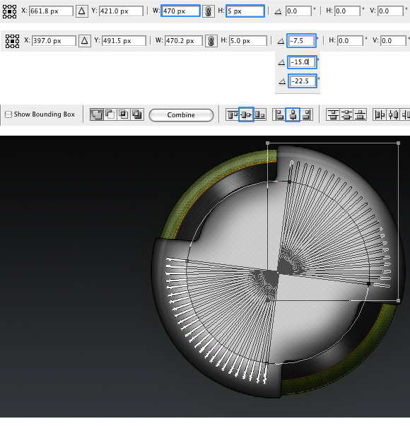
Step 14
The next step is a bit tedious, I admit. However, Photoshop lacks the ability to align shapes on paths, and so we must do this step by step in a repetitive manner. Grab the Rectangle Tool (U) and horizontally draw a rectangle 5px wide and 470px long (you can draw one at any size and then change its size by using the Transform Menu, as you can see below).
Grab the Path Selection Tool (A) and select it. Make sure you are in Add To Shape Area mode and then Alt + Shift-drag the rectangle up to duplicate it. Repeat this until you get twenty-five rectangles. Now comes the tedious part - you will need to rotate twenty-four of these rectangles in order to get them organized in a circle.
You can rotate them in -7.5 degrees multiplies. When you are done select all the shapes using the Path Selection Tool (A) and align their horizontal and vertical centers. To finish this step, select the Ellipse Tool (Shift + U), make sure you are in Subtract From Shape Area (-) mode, and draw a large circle leaving only around 10px or so from the original rectangle lines (see below). Repeat the last action, this time with a Rectangle Tool (U) to remove all unnecessary shapes. You've made it through this step! Woohoo!.
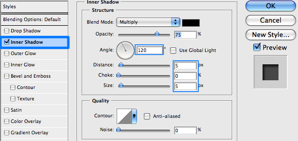
Step 15
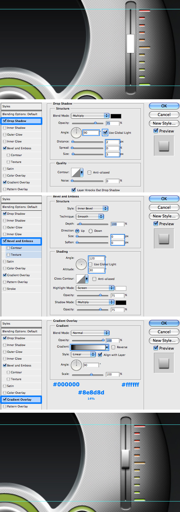
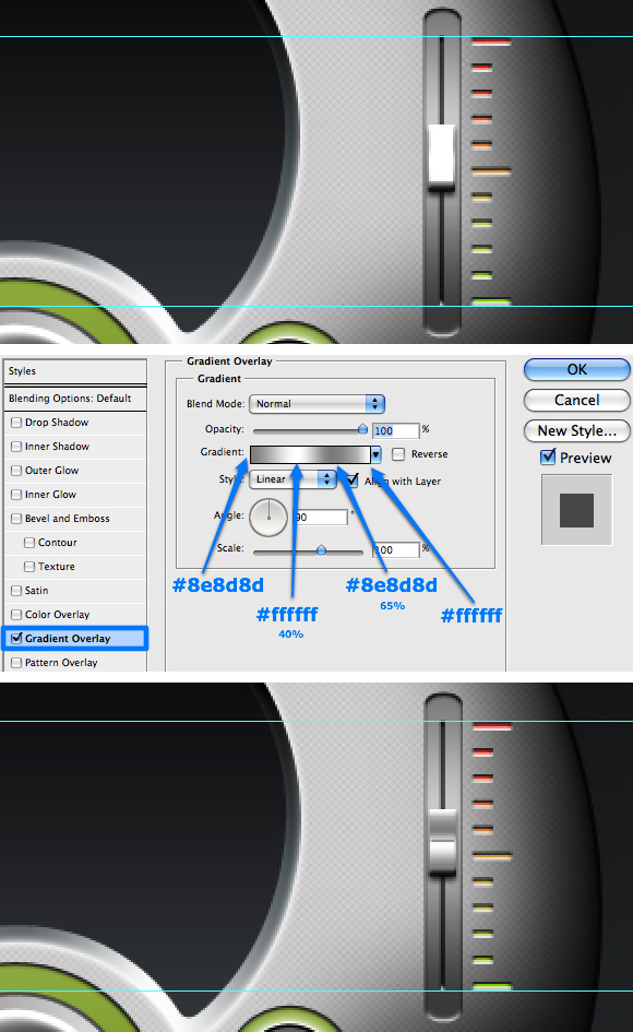
Name the layer "Decorations" and apply some Inner Shadow using the following settings.
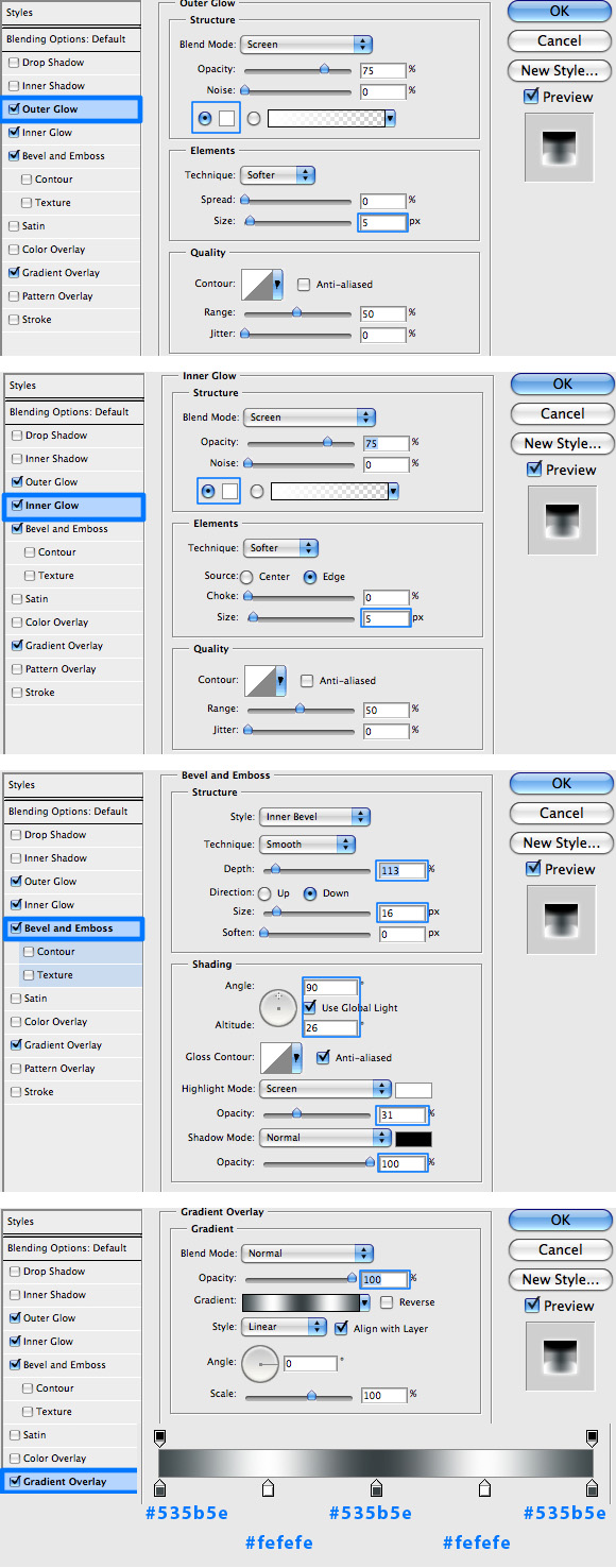
Step 16
Using the Rectangle, Ellipse, and Pen Tools, and the methods described above, create the main panel of the player. To create the 3D effect make the shape you are interested in, name the layer "Main_Panel_1" and apply the following layer styles.
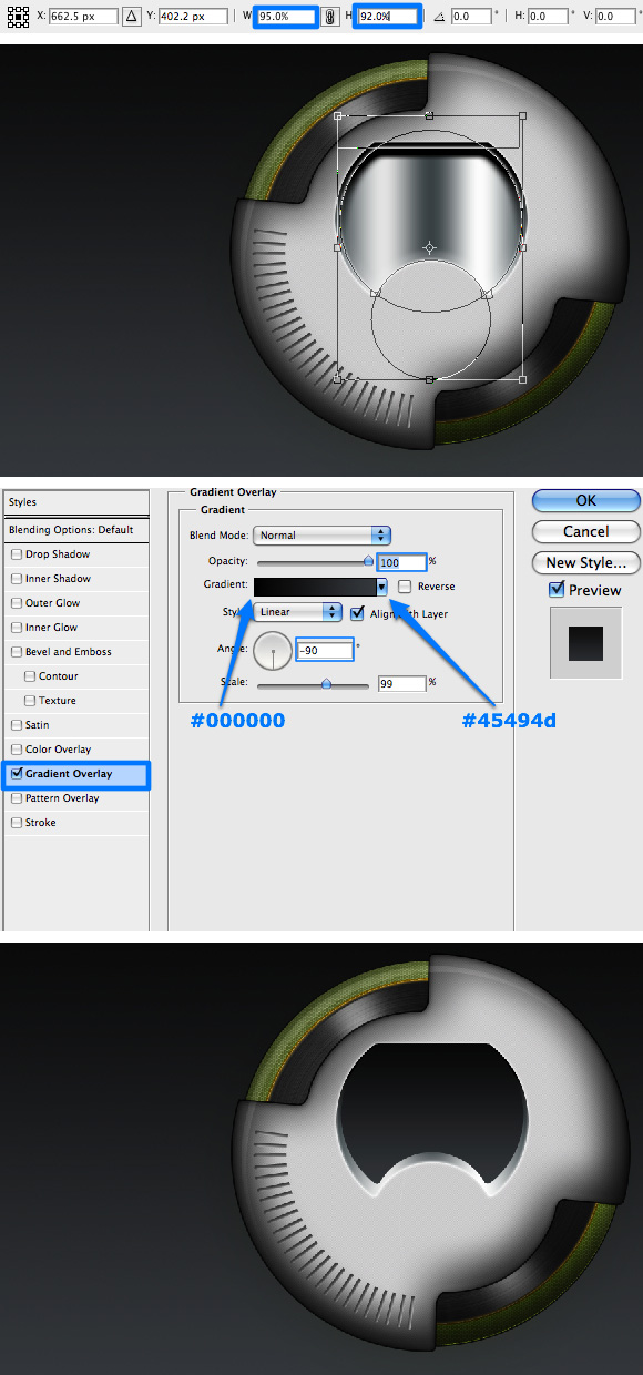
Step 17
Next, duplicate the "Main_Panel_1" and name the new layer "Main_Panel_2." Scale down the shape to 95% width and 92% height of it's original size by clicking Command + T and and using the Transform Toolbar. To finish the look, apply a Gradient Overlay as shown.
Step 18
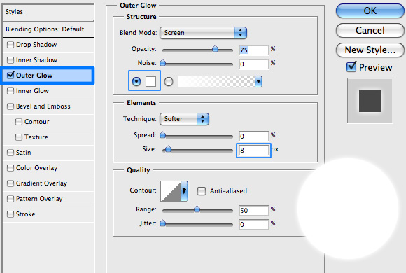
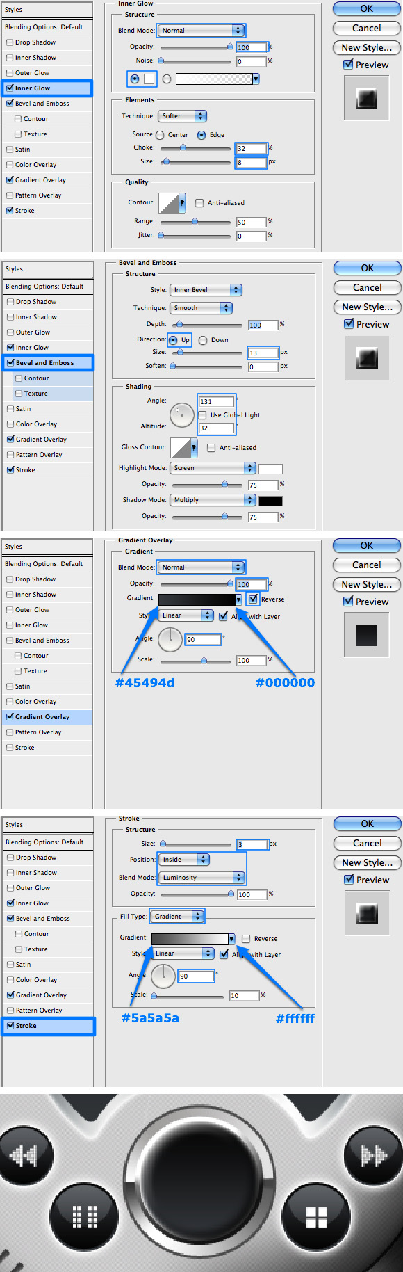
We will now start creating the audio control buttons and sliders. Choose white as your Foreground color, grab the Ellipse Tool (Shift + U), and while holding the Alt + Shift keys, draw a perfect circle. Name the layer "Control_button_1." Double-click the layer and apply the following Outer Glow settings.
Step 19
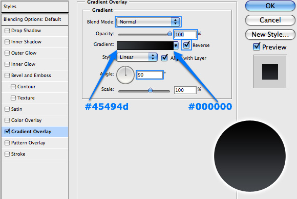
Duplicate the "Control_button_1" layer and rename the new layer "Control_button_2." Scale down the size of the shape to 97% using the methods we have discussed above, and apply the following Gradient Overlay.
Step 20
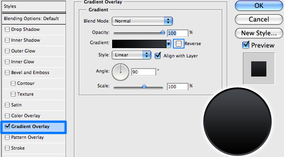
Repeat Step 19, this time on the "Control_button_2" layer, naming the new layer "Control_button_3." The Gradient Overlay applied to this layer is the same as in the previous step, only not reversed.
Step 21
Create a new layer and position it above the "Control_button_3" layer. Name it "Control_Glare." Grab the Elliptical Marquee Tool (M) and draw an oval shape, which will intersect with the button graphics.
Click Command + Shift + Alt on the "Control_button_1" layer's thumbnail - this will select only the area that intersects between the two selections. Fill this area with a white color and adjust the layer's Blending Mode to Soft Light with an Opacity of 70%.
Step 22
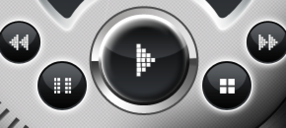
Group all the Layers created in Steps 18 - 21 and name the group "Forward Button." Duplicate the group in order to create the buttons for rewind, stop, and pause actions, then rename them accordingly. Resize and position the buttons as shown below.
Step 23
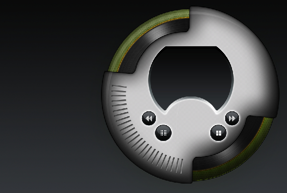
Create the control button icons by using the Rectangle Tool (U) repeating the methods of Add To Shape Area and Subtract From Shape Area, which we have covered in previous steps. Place each icon in its appropriate button group below the "Control_Glare" button. Also, while creating the triangles for the forward and rewind icons, also create one for the play icon.
Step 24
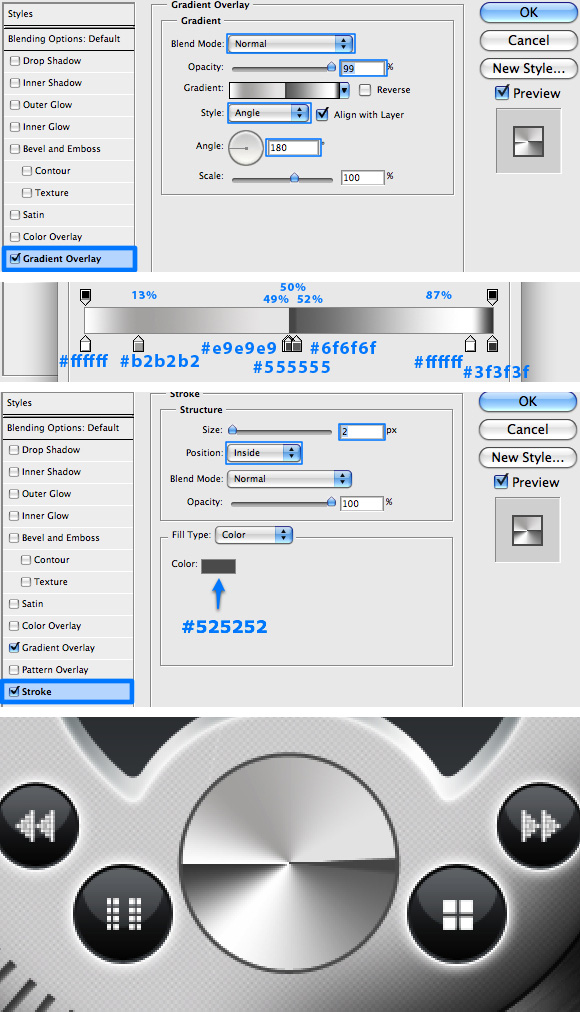
We will now create the Play button. Grab the Ellipse Tool (Shift + U) and draw a perfect circle, position it between the pause and stop buttons. Name this layer "Play_Button_1" and apply the following layer styles.
Step 25
Duplicate the "Play_Button_1" layer and rename the new layer "Play_Button_2." Scale down the size of the shape to 85% using the methods we have discussed above, and apply the following layer styles.
Step 26
Repeat Step 21's actions to create a glare on the play button. Name the new layer "Play_Button_Glare" and change its Blending Mode to Soft Light with 70% Opacity. Also, create a new layer which you need to position below "Play_Button_Glare" layer where you will place the play icon you created in Step 23. You can also group all the play button's layers and name the group "Play Button."
Step 27
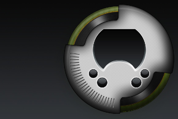
Use the Ellipse Tool (Shift + U), Pen Tool (P), and the Add To Shape Area, also use the previous method to create the button background area. Be sure to first create the circles surrounding the buttons, center-align them horizontally and vertically with the buttons and then connect them with the Pen Tool. Once you are done, name the layer "Buttons_Bk," place it behind the "Play Button" group, and apply the following layer styles.
Step 28
Using the Rounded Rectangle Tool, create the following shape. Once you have the shapes ready, change to the Rectangle Tool (U) and click on Subtract From Shape Area (-) in the Options Bar. Draw a large rectangle to cover most of the left side of the previously created lines. When done, rename the layer "Volume_Levels" and apply the following layer styles.
Step 29
We will now begin our work on the volume and balance sliders. Set your Foreground color to #8e8e8e, grab the Rounded Rectangle Tool (Shift + U), set the radius to 10px in the Options Bar, and draw a vertical rectangle shape. Name the shape layer "Volume_Rail" and adjust its position and scale according to the image below. Once you are done, apply the following layer styles as well.
Step 30
Grab the Line Tool (Shift + U), set the weight to 2px in the Options Bar and the Foreground color to #3b3b3b. Next, draw a vertical line in the middle of the "Volume_Rail" shape. You may aid yourself with two guides like I have which will make things a bit more accurate.
When done, name the layer "Volume_Rail_1," select the Move Tool (V), and align the two layers' vertical and horizontal centers using the Options Bar. Right-click on the "Volume_Rail" layer and copy the layer style from that layer to the layer you have just created.
Step 31
Creating the actual slider is quite easy. Grab the Rectangle Tool (U) and draw a rectangle anywhere on the slider rail, don't worry about the actual placement as you can always horizontally align the shape with the "Volume_Rail_1" layer. Once you are satisfied with the size of the shape, rename its layer "Slider_1" and apply the following (you guessed it!) layer styles.
Step 32
To complete the slider simply duplicate the "Slider_1" layer, and scale it down to 95% width and 90% height as we have done before. While still in Transform mode, move the shape up until it almost reaches the end of the the "Slider_1" shape, and hit Enter. Rename this layer "Slider_2" and add the following Gradient Overlay.
You can also select #a1a1a1 as your Foreground color, grab the Line Tool and draw a small line in the middle of the "Slider_2" shape to add an additional realistic touch to the slider.
Grab the Text Tool (T), select your desired font, and size (I used the font Estrangelo Edessa at 10pt) and type the word volume. Position the text above the slider. Next, grab the Polygon Tool (Shift + U), choose 3 as the number of sides in the Options Bar, and draw two small triangles indicating up/down directions. Both the text and the triangles are in #414040 color.
Step 33
Group all the volume slider's layers (including the rail) and name the group "Volume Slider." Duplicate this group, rename it "Balance Slider" (remember to also rename the layers accordingly) and then rotate and scale the shapes into their position as shown below. Note, because of rotation, some of the layer style values will need to be adjusted:
- In the "Balance_Rail" layer change the Gradient Overlay angle to -90 degrees.
- In the all slider layers, the Gradient Overlay angle should be 180 degrees.
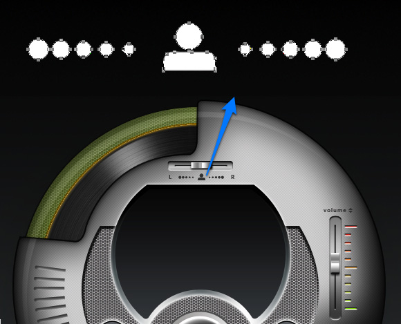
Select #414040 as your Foreground color and using the Ellipse and Rounded Rectangle Tools (Shift + U) create the balance icon as appears below. To finish, grab the Text Tool and type L and then R, and position them as in the example (I used the font Estrangelo Edessa at a size of 10pt).
Step 34
We will now focus on the player's main panel. For this section I have used a free font called Arcade. I selected this font as part of my overall design concept, but if you followed a different concept, feel free to use a different one. The player's main panel consists of the following parts.
Step 35
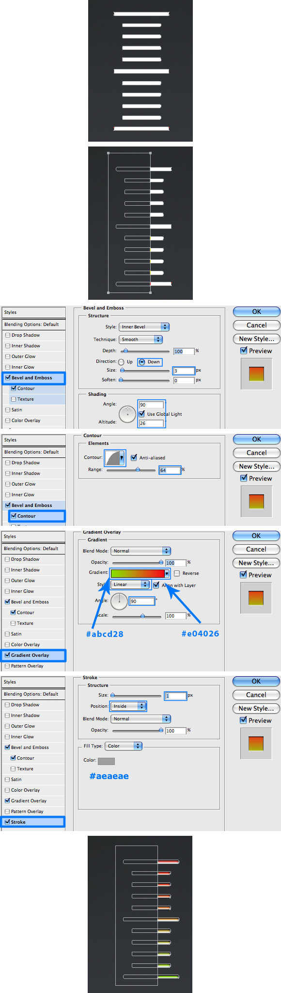
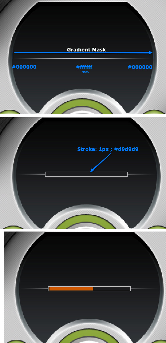
We'll start with the progress bar element. Choose white as your Foreground color, grab the Line Tool (Shift + U), select 1px as the weight from the Options Bar, and draw a line from one side of the main panel to its opposite, preferably in the middle. Name this layer "Decoration" and create a new Layer Mask. Next, while the mask is selected, choose the Gradient Tool (G) and prepare a gradient as shown below. Draw the gradient as marked below to create the desired fading effect.
Next pick up the Rectangle Tool (U), press (D) to reset your color palette, and draw a rectangle as shown below. Name this layer "Progress_1" and vertically align this layer's center with the "Decoration" layer. Apply the below specified Stroke.
Grab the Rectangle Tool (U) again, choose #c97507 as your Foreground color, and draw a rectangle inside the "Progress_1" shape as shown below. Name this layer "Progress_2."
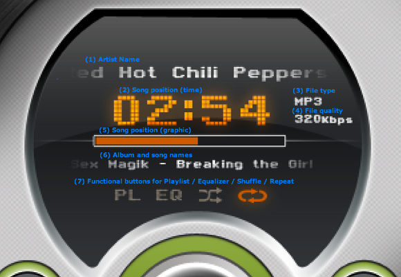
Step 36
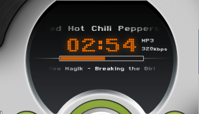
Use the same method described in Step 35 and add the song info (artist, album, and song names). You can also add additional track information such as the song's progress length, track quality, and file type. In my design I have used some Outer Glow to pop out the song's progress element a bit.
Step 37
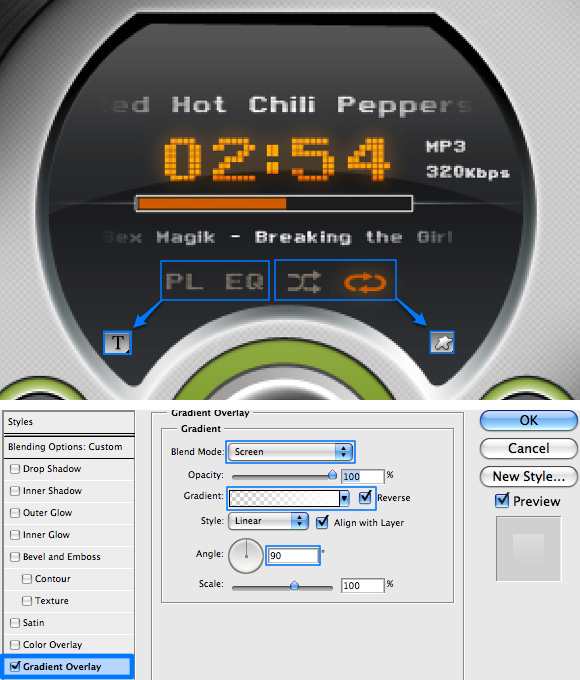
Use the Text Tool (T) and the Custom Shape Tool (Shift + U) to create the functional buttons, the later offers a variety of custom shapes which you can use to design your icons. To finish the main panel design, choose white as your Foreground color. Next, grab the Pen Tool (P) and draw a glare shape similar to the example below. When done name the layer "Panel_Glare," and apply the Gradient Overlay outlined below, then change the layer's Blending Mode to Soft Light with an Opacity of 40%.
Step 38
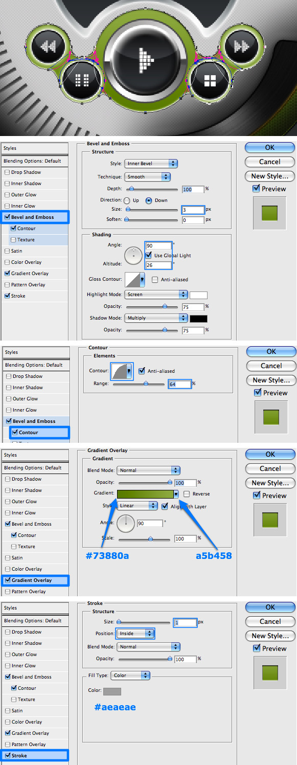
As you can see in the final image, I have added some decoration behind the main panel and the control buttons' background. To create this decoration grab the Ellipse Tool (Shift + U) and draw a large perfect circle. Select the Rectangle Tool (U), choose Subtract From Shape Area from the Options Bar.
Now draw two rectangles. One intersects the top side and the other the bottom side of the circle. Resize the shape to fit in the appropriate area. Once you have the shape ready, place the layer below the "Buttons_Bk" layer. Apply the layer styles as shown.
Step 39
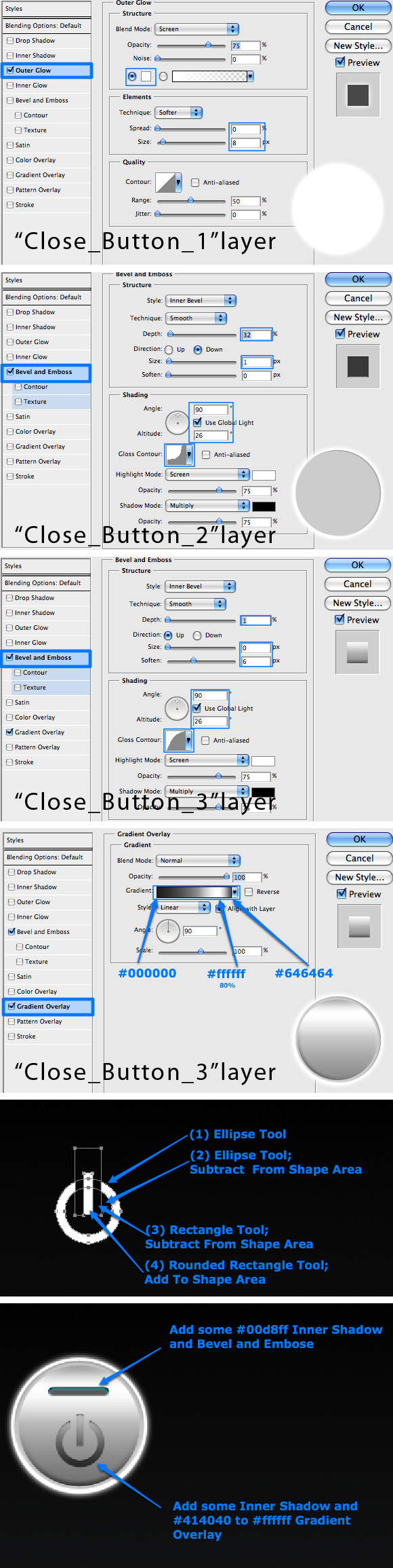
The last elements to create are the Close, Minimize, and Compact buttons. The close button is quite simple to create as it is done using the same method we used for the control buttons (Steps 18 through 21). The difference is in the layer styles. In the screenshots below you can see the settings and how to create that Close icon. I will not explain how to create the Minimize and Compact icons, as they are very easy to accomplish.
Step 40
Now it is time to start wrapping things up. Group all layers (excluding the background of course) and name the group "Player 1." Duplicate the group twice, name the two new groups "Player 2" and "Player 3" and re-order the three groups in a descending order.
Merge all the layers in "Player 1" group, name the new layer "Final1." Duplicate the layer and go to Filter > Blur > Gaussian Blur, then select Radius of 1.0 and apply. Create a layer mask, press (D) to reset your color palettem and (X) to make black as your Foreground color.
Select the Gradient Tool making sure you are on Radial Gradient mode. Next use the default Foreground to Background preset to apply the gradient from the center of the player to the outside, so that the center area of the player will be sharp, while the edges will be a bit blurry. This will be used to create a depth of field effect. Name this layer "Final1_Blur."
Step 41
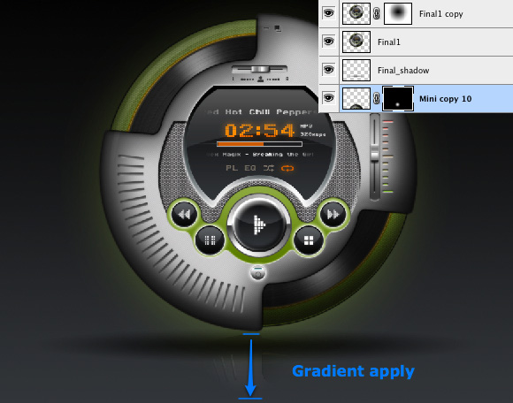
Create a new layer, grab the Gradient tool again (G), and select the Foreground to Transparent gradient preset. Draw again from the center of the player to the outside. Click Command + T to transform the gradient and scale it from top to bottom creating a nice shadow at the width of the player. Place the shape a bit further away from the bottom of the player to create a floating effect. Name this layer "Fianl1_Shadow" and place it under "Final1" layer.
Step 42
Duplicate the "Final1" layer and place it under "Final1_Shadow." Click Command + T to transform the shape. Next, while in that mode, Control-click on the transformed shape and choose Flip Vertical. Drag the transformed shape down, place it in the middle of the shadow area and hit Enter. Name this layer "Final1_ref," change its Opacity to 50% and place it under the "Final1_Shadow" layer.
Create a layer mask, press (D) to reset your color palette. Select the Gradient Tool making sure you are on the Radial Gradient mode and use the default Foreground to Background preset to apply the small gradient from the top of the flipped player to its center. This will make a nice reflection of a rounded object.
Final Image
That's it! We're done! In my final image I have changed the duplicated players' color themes, positioned them at the back with more Gaussian Blur applied. I really hope you've learned a lot from this tutorial, and I can't wait to see you put these practices into good use.