Ready to get your feet wet with the basics of Photoshop? Here’s where you get familiar with the Photoshop environment — the desktop, menus, and panels. We also introduce the key tools and explain what each one does.
| Photoshop has such an abundance of tools — and so many ways to use those tools here we will cover how to get started on Photoshop and how to view and navigate your image window. Here’s also where we give you all the important details about the o’mighty Adobe Bridge and how to customize your workspace and preference settings. |
| Lesson overview • Open Photoshop files. • Investigating the Menu bar. • Select and use some of the tools in the Tools panel. • Set options for a selected tool using the options bar. • Use various methods to zoom in and out on an image. • Select, rearrange, and use panels. • Choose commands in panel and context menus. • Open and use a panel docked in the panel well. • Undo actions to correct mistakes or to make different choices. • Customize the workspace. |
As you work with Photoshop, you’ll find out that you can often accomplish the same task several ways. To make the best use of the extensive editing capabilities in Photoshop, you must first learn to navigate the work area.
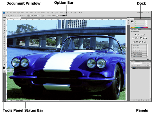
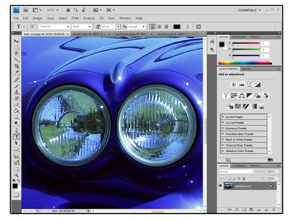
When you launch Photoshop, the desktop workspace, shown in Figure bellow appears. Like the real-world desktop where your keyboard and monitor reside, the Photoshop desktop is a place for you to put all the images you’re working with.
Starting Photoshop and opening a file:
Let’s start Adobe Photoshop and reset the default preferences.
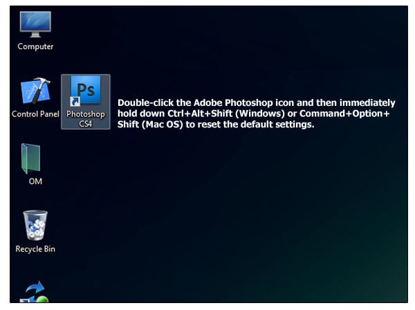
1.On the desktop, double-click the Adobe Photoshop icon to start Adobe Photoshop and then immediately hold down Ctrl+Alt+Shift (Windows) or Command+Option+Shift (Mac OS) to reset the default settings.
2.When prompted, click Yes to confirm that you want to delete the Photoshop Settings file.
3.Choose File > Open, and navigate to the folder where your files are stored.
4.Select the file and click Open.
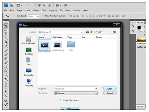
The hot_rod.jpg file opens in its own window, this window is called the image window. In this file,an image of a Hot Rod car has been enhanced.
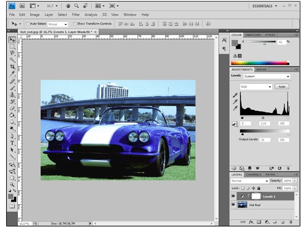
5.Choose File > Close, or click the close button on the title bar of the image window. (Do not close Photoshop.)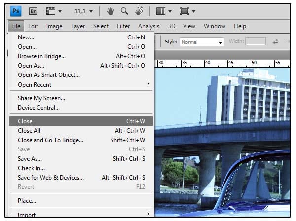
Opening a file with Adobe Bridge:
As we said earlier in Photoshop you can accomplish the same task in different ways, in the previous exercise you used the Open command to open a file.
Now you’ll open another file using Adobe Bridge, a visual file browser that helps you out to find the image file that you need.
1.Click the Launch Bridge button in the application bar. If you’re prompted to enable the Photoshop extension in Bridge, click OK.

Adobe Bridge opens, displaying a collection of panels, menus, and buttons.
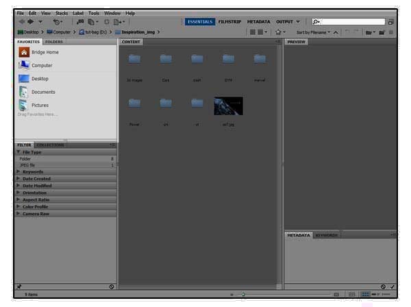
2.From the Folders panel in the upper-left corner, browse to the directory where you have stored your file.
3.Select the folder, and choose File > Add To Favorites. Adding files,folders, application icons, and other assets that you use often to the Favorites panel lets you access them quickly.
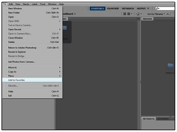
4.Select the Favorites tab to open the panel, and click the folder you just added to open it.Then, in the Content panel, double-click the folder.
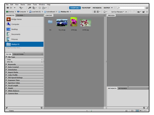
Thumbnail previews of the folder contents appear in the Content panel.
5.Double-click the file thumbnail in the Content panel to open the file,or select the thumbnail and choose File > Open. the file that you chose opens in Photoshop. Leave Bridge open you’ll use it to locate and open files later.
Adobe Bridge is much more than a convenient visual interface for opening files. You’ll have the chance to learn more about the many features and functions of Adobe Bridge in latter tutorials.
Selecting and using a tool from the Tools panel:
Photoshop provides an integrated set of tools for producing sophisticated graphics for print, web, and mobile viewing.
The Tools panel the long, narrow panel on the far left side of the work area contains selection tools, painting and editing tools, foreground and background color selection boxes, and viewing tools. In Photoshop Extended, it also includes 3D tools.
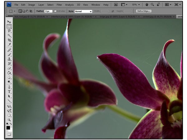
Let’s start by using the Zoom tool, which appears also in many other Adobe applications,including Illustrator, InDesign, and Acrobat.
1.Click the double-arrow button just above the Tools panel to toggle to a double column view. Click the arrow again to return to a single-column Tools panel and use your screen space more efficiently.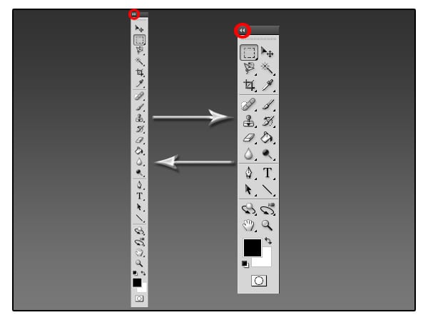
2.Examine the status bar at the bottom of the work area (Windows) or image window (Mac OS), and notice the percentage listed on the far left. This represents the current enlargement view of the image, or zoom level.
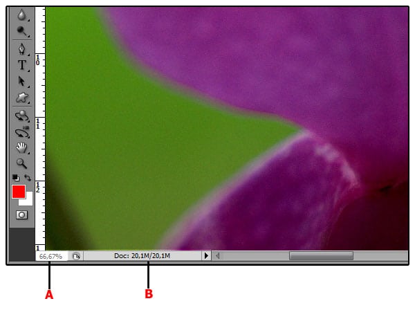
A. Zoom level B. Status bar
3.Move the pointer over the Tools panel and hover it over the magnifying-glass icon until a tool tip appears. The tool tip displays the tool’s name (Zoom tool) and keyboard shortcut (Z).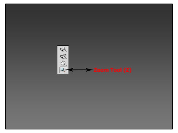
4.Click the Zoom tool in the Tools panel or press Z to select it.
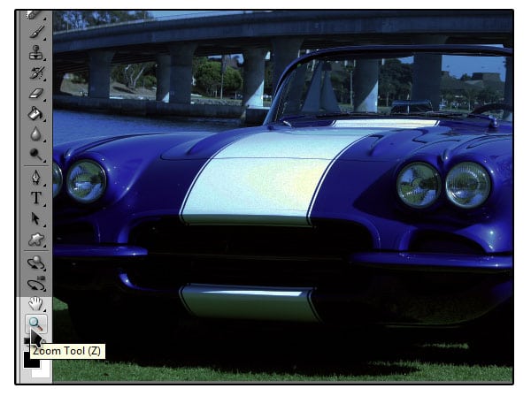
5.Move the pointer over the image window. The pointer now looks like a tiny magnifying glass with a plus sign (+) in the center of the glass.
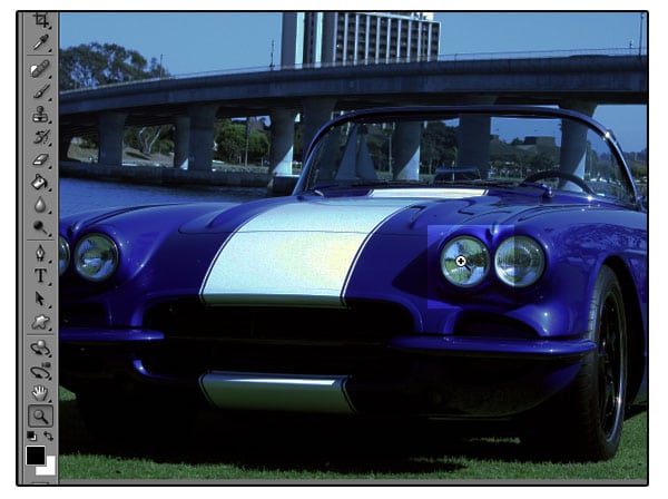
6.Click anywhere in the image window.
The image enlarges to a preset percentage level, which replaces the previous value in the status bar. The location you clicked when you used the Zoom tool is centered in the enlarged view. If you click again, the zoom advances to the next preset level, up to a maximum of 3200%.
7.Hold down the Alt key (Windows) or Option key (Mac OS) so that the Zoom tool pointer appears with a minus sign (-) in the center of the magnifying glass, and then click anywhere in the image. Then release the Alt or Option key. Now the view zooms out to a lower preset magnification, so that you can see more of the image, but in less detail.
8.Using the Zoom tool, drag a rectangle to enclose the area of the image that includes the headlight.
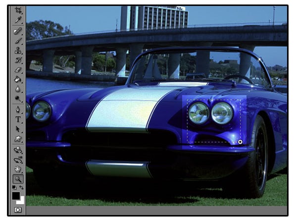
The image enlarges so that the area you enclosed in your rectangle now fills the entire image window. You have now used three methods with the Zoom tool to change the magnification in the image window: clicking, holding down a keyboard modifier while clicking,and dragging to define a magnification area. Many of the other tools in the Tools panel can be used with keyboard combinations, as well.
Selecting and using a hidden tool:
Photoshop has many tools you can use to edit image files, but you will probably work with only a few of them at a time. The Tools panel arranges some of the tools in groups, with only one tool shown for each group. The other tools in the group are hidden behind that tool.
A small triangle in the lower-right corner of a button is your clue that other tools are available but hidden under that tool.
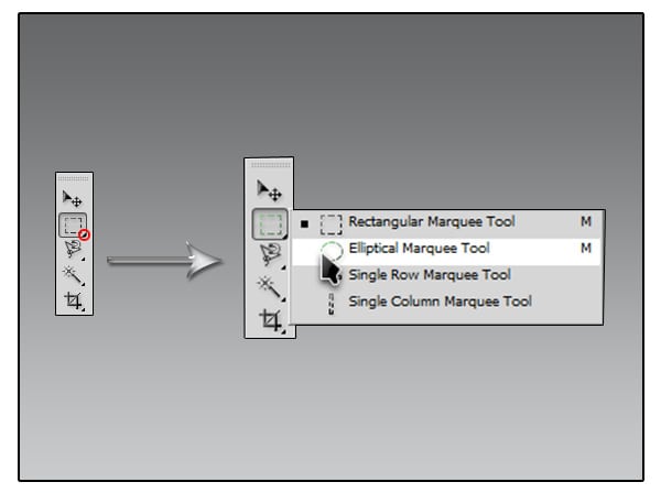
1.Position the pointer over the second tool from the top in the Tools panel until the tool tip appears. The tool tip identifies the Rectangular Marquee tool with the keyboard shortcut M. Select that tool.
2.Select the Elliptical Marquee tool,which is hidden behind the Rectangular Marquee tool, using one of the following methods:
• Press and hold the mouse button over the Rectangular Marquee tool to open the pop-up list of hidden tools, and select the Elliptical Marquee tool.
• Alt-click (Windows) or Option-click (Mac OS) the tool button in the Tools panel to cycle through the hidden marquee tools until the Elliptical Marquee tool is selected.
• Press Shift+M, which switches between the Rectangular and Elliptical Marquee tools.
3.Move the pointer over the image window, to the first headlight. When the Elliptical Marquee tool is selected, the pointer becomes cross hairs (+).
4.Drag the pointer down and to the right to draw an ellipse around the headlight, and then release the mouse button. An animated dashed line indicates that the area inside it is selected. When you select an area, it becomes the only editable area of the image.The area outside the selection is protected.
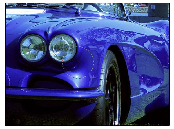
5.Move the pointer inside your elliptical selection so that the pointer appears as an arrow with a small rectangle.
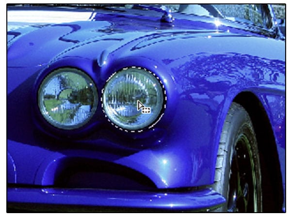
6.Drag the selection so that it is accurately centered over the headlight.
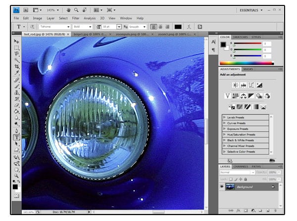
| When you drag the selection, only the selection border moves, not pixels in the image. When you want to move the pixels in the image, you’ll need to use a different technique. You’ll learn more about making different kinds of selections and moving the selection contents latter. |
Using keyboard combinations with tool actions:
Many tools can operate under certain constraints. You usually activate these modes by holding down specific keyboard keys as you move the tool with the mouse. Some tools have modes that you choose in the options bar.
The next task is to make a fresh start at selecting the headlight. This time, you’ll use a keyboard combination that constrains the elliptical selection to a circle that you’ll draw from the center outward instead of from the outside inward.
1.Make sure that the Elliptical Marquee tool is still selected to deactivate the current selection do one of the following steps:
• In the image window, click anywhere outside the selected area.
• Choose Select > Deselect.
• Use the keyboard shortcut Ctrl+D (Windows) or Command+D (Mac OS).
2.Position the pointer in the center of the headlight.
3.Press Alt+Shift (Windows) or Option+Shift(Mac OS) and drag outward from the center of the headlight until the circle completely encloses the headlight. The Shift key constrains the ellipse to a perfect circle.

4.Carefully release first the mouse button and then the keyboard keys.
| If you are not satisfied with the selection circle, you can move it: Place the pointer inside the circle and drag, or click outside the selection circle to deselect it and then try again. Note: If you accidentally release the Alt or Option key prematurely, the tool reverts to its normal behavior (drawing from the edge). If, however,you haven’t yet released the mouse button, you can just press the key down again, and the selection changes back. If you have released the mouse button, simply start again at Step 1. |
Adding to the selection:
As we said before in Photoshop you can use different tools to achive the same result. If you want detailed selections without too much effort, here’s the perfect tool for the task so next we are going to use the Magnetic Lasso tool to add to the current selection.
1.Position the pointer over the Lasso tool which is located under the Rectangular Marquee tool press and hold the mouse button to open the pop-up list of hidden tools.
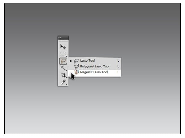
2.Select the Magnetic Lasso tool and move the pointer over the image window, to the second headlight press the shift key notice that a small plus sign appears this means that now you can add another selection.
This tool lets you make more detailed selections, particularly of specific objects in an image, without requiring too much effort. You don’t have to keep the mouse button held down when drawing either –click once to start, drag close to the object edge, then double-click to end.Note that the tool automatically places ‘anchor points’ as you draw to keep the selection in place.
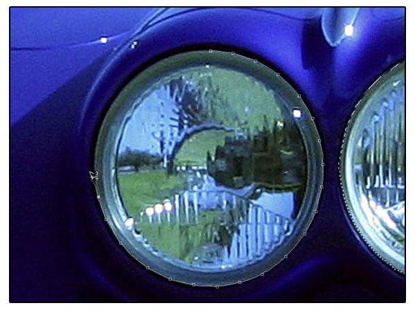
If the area you are tracing is too indistinct and low in contrast for Photoshop to find an edge itself, you can click the mouse to force an anchor point to be placed. The default setting in the Options bar is fine most of the time,
| Tip:Fast pan and zoom You can use the Pan and Zoom shortcuts to move the image around while still in mid-selection. |
3.Repeat the second step for the other 2 remaining headlights.
Applying a change to a selected area:
Normally, you’d change the area within the selection. But in order to spotlight the headlight, you’ll want to darken the rest of the image, not the area inside the current selection. To protect that area, you’ll invert the selection, so that everything but the headlight is selected in the image.
1.Choose Select > Inverse.
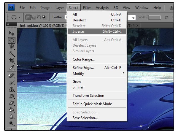
Although the animated selection border around the headlight looks the same, notice that a similar border appears all around the edges of the image. Now the rest of the image is selected and can be edited, while the area within the circle is not selected. The unselected area (the headlight) cannot be changed while the selection is active.
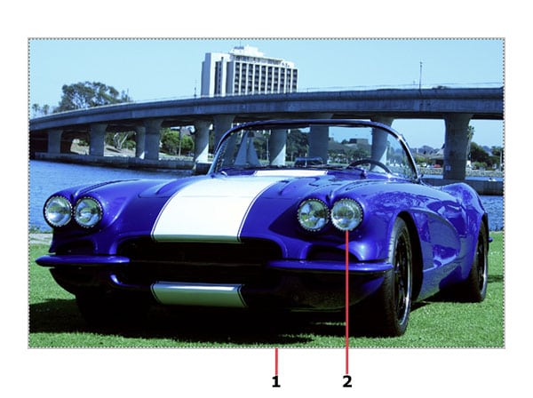
1. Selected (editable) area
2. Unselected (protected)area
| Tip: The keyboard shortcut for this command, Ctrl+Shift+I(Windows) or Command+Shift+I(Mac OS) appears by the command name in the Select menu. In the future, you can just press that keyboard combination to invert a selection. |
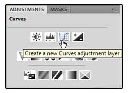
2.Click the Curves icon in the Adjustments panel to add a Curves adjustment layer. The Curves panel opens.
 3.In the Curves panel, drag the control point in the upper-right corner of the graph straight across to the left until the Input value is approximately 204. The Output value should remain 255. As you drag, highlights are brightened in the selected area of the image.
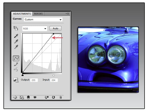
As you drag, highlights are brightened in the selected area of the image.
4.Adjust the Input value up or down until you are satisfied with the results.
5.In the Layers panel, examine the Curves adjustment layer. (If the Layers panel
isn’t open, click its tab or choose Window > Layers.)
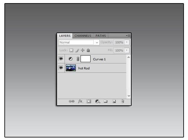
Adjustment layers let you make changes to your image, such as adjusting the brightness of the highlights in this car, without affecting the actual pixels. Because you’ve used an adjustment layer, you can always return to the original image by hiding or deleting the adjustment layer—and you can edit the adjustment layer at any time.
6.Do one of the following:
• If you want to save your changes, choose File > Save and then choose File >Close.
• If you want to revert to the unaltered version of the file, choose File > Close and click No or Don’t Save when you are asked if you want to save your changes.
• To save your changes without affecting the original file, choose File > Save
As, and then either rename the file or save it to a different folder on your computer, and click OK. Then choose File > Close.
You don’t have to deselect, because closing the file cancels the selection.
Zooming and scrolling with the Navigator panel:
The Navigator panel is another speedy way to make large changes in the zoom level, especially when the exact percentage of magnification is unimportant.It’s also a great way to scroll around in an image, because the thumbnail shows you exactly what part of the image appears in the image window.To open the Navigator panel, choose Window > Navigator.The slider under the image thumbnail in the Navigator panel enlarges the image when you drag it to the right (toward the large mountain icon) and reduces it when you drag to the left.
 The red rectangular outline represents the area of the image that appears in the image window. When you zoom in far enough that the image window shows only part of the image, you can drag the red outline around the thumbnail area to see other areas of the image.
NOTE : ALL CREDITS FOR THE ORIGINAL TUTORIAL MAKER :)
=================================
=== For more tutorials keep visiting ;) ===
= http://photoshop-manic.blogspot.com =
=================================
Adobe Photoshop Training - Photoshop Classes -
Photoshop Tutorial - Photoshop Seminars -
Photoshop CS3 - Photoshop CS4 - Photoshop 7 -
Photoshop Tutorial Downloads - Lots more :-)


