This tutorial will show some similar steps as we will also be using a rendered 3D object. First make sure you've downloaded the file that I mentioned above.I'm going to show you the simple steps to creating this image but feel free to add your own bits in. I'm also going to release a set of wallpapers in different colors like this soon for anyone to download so check back. Lets get going!
 Reduced: 88% of original size [ 580 x 435 ] - Click to view full image
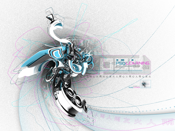
Step 1
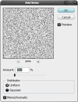
Create a new document with dimensions; 1600×1200px then create a new layer and fill it white, a quick way to fill the layer white would be to hit D then Ctrl+Backspace. Now go Filter>Noise>Add Noise and use the settings shown below to give use a noisy background.
Step 2
We are going to add a slight shadow below where we are going to place the render. Your foreground color should still be black so create a new layer, now select the brush tool and choose an 800px 0% harness round brush and click once to give the effect shown below.
Reduced: 88% of original size [ 580 x 435 ] - Click to view full image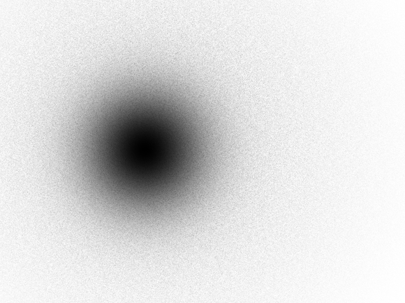
Step 3
Open 1.png from the render pack then copy and paste it into this document then scale it down slightly by hitting Ctrl+T and dragging the corners while holding shift then move it above the shadow like shown in the image below.
Reduced: 88% of original size [ 580 x 435 ] - Click to view full image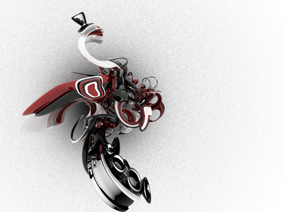
Step 4
Go Image>Adjustments>Desaturate then go Filter>DIstort>Twirl and use a value of 125°.
Reduced: 88% of original size [ 580 x 435 ] - Click to view full image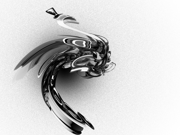
Step 5
Change the blend mode of this layer to soft light and change the opacity to 75%.
Reduced: 88% of original size [ 580 x 435 ] - Click to view full image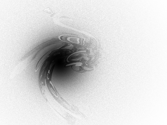
Step 6
Now paste the render in again, you could probably just hit Ctrl+V unless you've copied something else. Now scale this down in the same way and position it like so.
Reduced: 88% of original size [ 580 x 435 ] - Click to view full image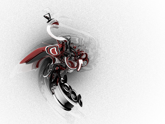
Step 7
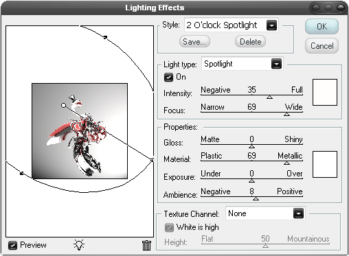
The render is looking a bit too dark at the moment so go Filter>Render>Lighting Effects and try and mimic the settings shown below as best as possible.
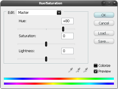
Step 8
Next go Image>Adjustments>Hue/Saturation and change the hue to +80.
Step 9
Lets take a look at where we are, your's should look similar to the one shown below but probably not exactly the same. We've added a simple background using the noise filter, you could have used a texture for this also like a paper texture or a concrete texture, both would have looked good also. We added a bit of lighting with the brush tool, you could have used the gradient tool set at radial to give the same effect. The faded render gives a slight shadow as well but doesn't look like the render since we twirled it. We enhanced the render by using the lighting effects filter and a color adjustment, this was important as the render will be the focal point so has to look perfect. This wasn't really a step, more of a recap. From here on every new layer we create will be created below the render layer as we want the render to remain the topmost layer.
Reduced: 88% of original size [ 580 x 435 ] - Click to view full image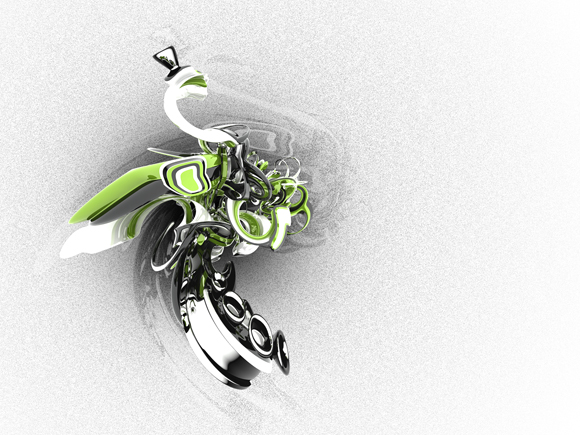
Step 10
Okay paste in the render again, scale it a bit and position it like in the image below.
Reduced: 88% of original size [ 580 x 435 ] - Click to view full image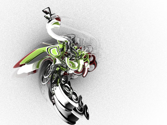
Step 11
In the layers panel change the fill opacity of this layer to 0% then right click on the layer and go to blending options and add a stroke using the settings shown below.
Reduced: 85% of original size [ 598 x 440 ] - Click to view full image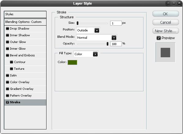
Step 12
This will have given you an outline of the render, I repeated the last two steps again but rotated the render slightly and used black instead of green as the stroke color. Later on I ended up making a few adjustments to these outlines so don't worry if your's doesn't look the same throughout the tutorial.
Reduced: 88% of original size [ 580 x 435 ] - Click to view full image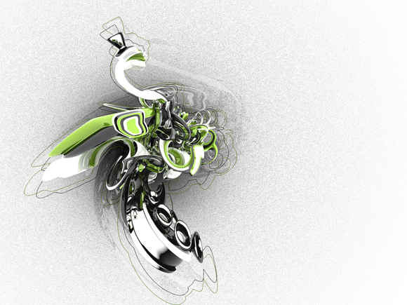
Step 13
This step might take a few tries to get right, first select the pen tool then in the main toolbar make sure the shape layers button is pressed, start byclicking somewhere on the render then click outwith document bounds and hold and drag to get a nice curve then add another point then connect it back to the first point with a curve. You should have something that looks like this and make sure the layer is behind the render layer.
Reduced: 88% of original size [ 580 x 435 ] - Click to view full image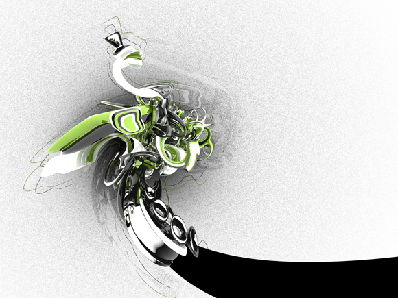
Step 14
Go into the blending optiions for this layer and add a drop shadow, inner glow and stroke using the settings shown below.
Reduced: 85% of original size [ 598 x 440 ] - Click to view full image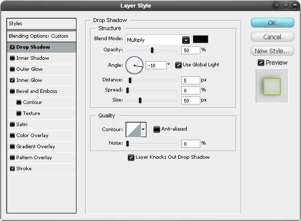 Reduced: 85% of original size [ 598 x 440 ] - Click to view full image
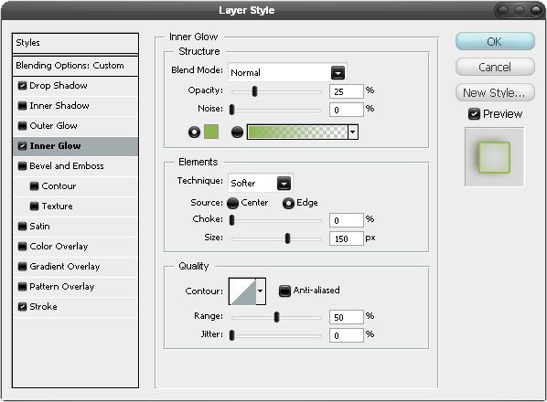 Reduced: 85% of original size [ 598 x 440 ] - Click to view full image
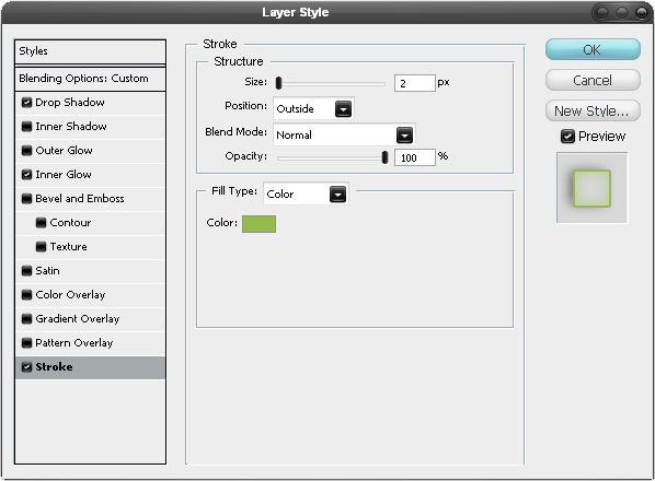
Step 15
Now repeat these steps to create another ribbon like shape, I lowered the opacity of the second one to 50%.
Reduced: 88% of original size [ 580 x 435 ] - Click to view full image
Step 16
Create a new layer then select the brush tool and choose a 3px hard round brush. Select a darkish green as the foreground color then select the pen tool and in the main toolbar press the paths button. Draw a path going from the middle of the render to outside the document and hold and drag to get a smooth curve, Right click within the document window and select stroke path and uncheck simulate pressure. Do this a few more times until you have about four or five lines. You may notice that I created a dotted line as well, this is optional but do it you you would go into the brush editor by going Window>Brushes then under brush tip shape you would increase the spacing then stroke the path.
Reduced: 88% of original size [ 580 x 435 ] - Click to view full image
Step 17
Change the blend mode of this layer to dissolve.
Reduced: 88% of original size [ 580 x 435 ] - Click to view full image
Step 18
We're going to add some random lines now so select the brush tool and change the diameter to 2px, I used three different colors here, a lime green a darker green and a cyan color. So first creat a new layer then just go wild with these three colors by drawing lots of freehand scribbles around the render. I've shown three examples below of what mine looked like.
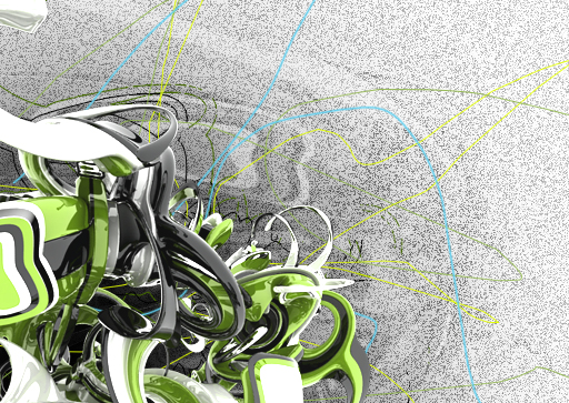 Reduced: 97% of original size [ 523 x 343 ] - Click to view full image
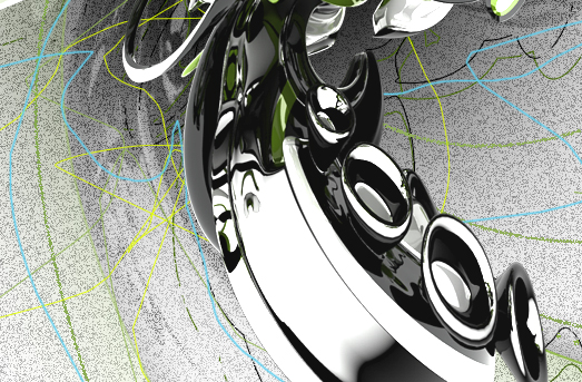 Reduced: 88% of original size [ 580 x 435 ] - Click to view full image
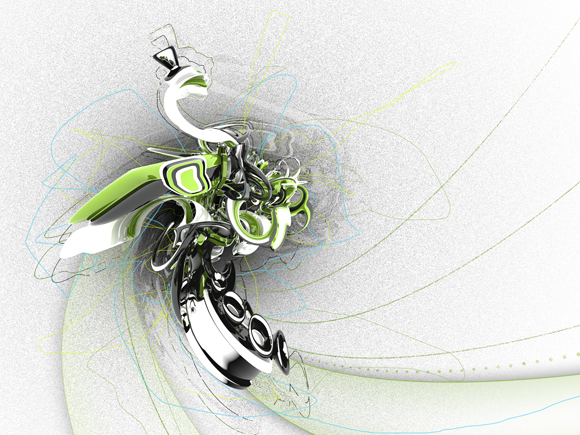
Step 19
We're going to go onto what I call the branding area, this is where you would tend to put your title, name, maybe website. However this has to look good as well so you need some nice typography and colors here. I'm not going to go into all the details of how I created this because you're obviously going to be wanting a different title and your name's probably not the same as mine, just make sure you create each element in a new layer. Create this shape by first making a new layer then selecting the polygonal lasso tool and holding shift to get straight lines, once you've closed the loop fill it black by going Edit>Fill and choosing black then in the layers panel change the fill opacity to 10%.
Reduced: 88% of original size [ 580 x 435 ] - Click to view full image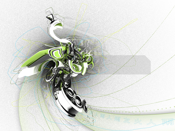
Step 20
Now go into the blending options for this layer and add a gradient overlay and a stroke mimicking the settings shown below.
Reduced: 85% of original size [ 598 x 440 ] - Click to view full image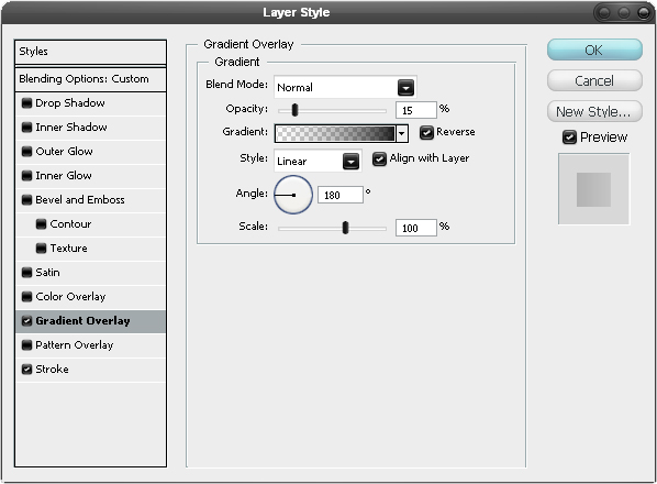 Reduced: 85% of original size [ 598 x 440 ] - Click to view full image
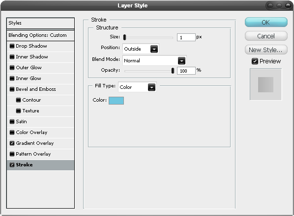
Step 21
Now you'll want to add something else to this box so I'll let you be creative in this step, you'll see that I just added a layer mask to this layer with the letters PSD but you can add or take away whatever you want from the box.
Reduced: 88% of original size [ 580 x 435 ] - Click to view full image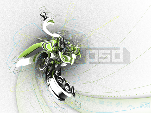
Step 22
Here I added some text in a techie font, I also added some simple green lines at the bootom of the box and added a stroked PSD. Basically just put your title in here somewhere and a few extra things if you want.
Reduced: 88% of original size [ 580 x 347 ] - Click to view full image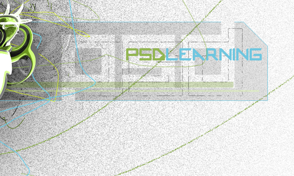
Step 23
Next I added some simple arrows above the text and some dots next to it. I then put in my website and some really small illegible text. I also put chinese text along the bottom of the box as this always looks good.
Reduced: 88% of original size [ 580 x 347 ] - Click to view full image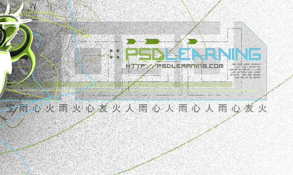
Step 24
Here what I did was to get a small version of the image by, in a new layer, going Image>Apply Image then sacaling it down and adding a border. Then I just put my name to finish it off.
Reduced: 88% of original size [ 580 x 347 ] - Click to view full image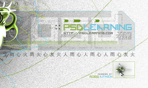
Step 25
Ussually at the end of creating an imagew like this, I make some small color adjustments using curves but here I tried changing the hue totally and actually quite liked the results, I'm not sure which I like better though but I've shown both below. To do this go to the top of the layer stack and add a hue/saturation adjustment layer by clicking the black and white circle button in the layers panel. You'll notice I've also added a few extra things and would encourage you to do the same and experiment a bit. Hope you found this tutorial useful!
Reduced: 88% of original size [ 580 x 435 ] - Click to view full image Reduced: 88% of original size [ 580 x 435 ] - Click to view full image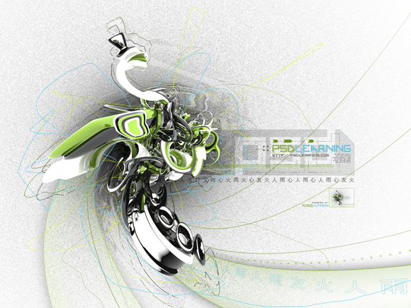
=================================
=== For more tutorials keep visiting ;) ===
= http://photoshop-manic.blogspot.com =
=================================
No comments:
Post a Comment