Step 1
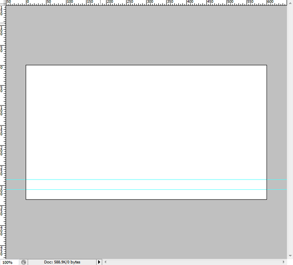
Open a new canvas that is 600x335px. Begin by showing rulers (View>Rulers), then create two guides similar to the image below. Create one at 285px and the other at 310px.
Step 2
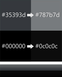
Create a Rectangle (U) that fills the lower ruled area and label the layer "lower bar." Open up the Effects Menu for the layer. Navigate to the Gradient Overlay property and apply a gradient between #000000 and #0c0c0c at 90 degrees.
Now create another rectangle in the upper rules area and name the layer "upper bar." Again open up the effects menu and apply a Gradient Overlay between #35393d and #787b7d at 90 degrees. Select the two rectangles created so far and change the Opacity to 90%. When a background is added later, this will provide a nice effect, as it allows the background to slightly show through.
Step 3
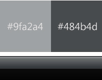
The next step is to add a highlight to the menu using the Line Tool (U). Select the Line Tool and change the weight to 2px. Draw a line across the bar and change the color to #9fa2a4. Rename this layer to "lower highlight." Now draw another line directly above the previous and change the color to #484b4d and change the name to "upper highlight." Group these layers with bar layers in a group called "bar." This stage completes the basis of the menu.
Step 4
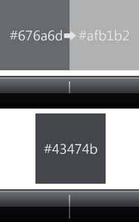
Now that the menu bar is complete, we can create a set of dividers to go between the text. Select the Line Tool again and leave the weight at 2px. Draw a vertical line from the center ruler mark that stops a few pixels before the highlight. This does not need to be exact and can easily be adjusted later. Open the effects menu and apply a Gradient Overlay at 90 degrees between #676a6d and #4d6672. Label this layer "upper divider."
Draw another vertical line from the center ruler going down and stopping the same distance from the edge as above. This section does not have a gradient, so change the color to #43474b. Rename this layer to "lower divider." Group the two sections of the divider and name the group "divider."
Step 5
Select the Type Tool (T) and change the color to white (#FFFFFF). The font I chose to use for the menu is called Segoe UI because it is the font used in the Vista user interface. However not everyone has this font, so as a replacement Arial will do. Set the size to 11pt and type your links out, spacing them evenly. Group them together and name the group "links."
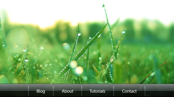
Now copy your dividers and space them in between the links. You should end up with something similar to this.

Step 6
Now the menu bar is basically completed, so you can add a background of your choice. The background I chose is a photograph of grass. Anything colorful or scenic will do.
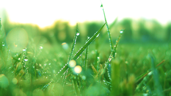
Copy your background into the menu and rename the layer Background. Make sure this layer is at the back in your layers palette. Note the transparency in the menu allows the background to show through without overpowering.
Step 7
This step will create the blurred rounded rectangle that is behind the text. This effect is quite common in Vista and is a good technique. It takes the focus of the background and places it on the text, but still shows the beautiful scene behind.
First of all, duplicate the background. This layer is not permanent, but we will be cutting a selection out of it. Then using the Rounded Rectangle Tool (U), draw a shape that starts past the left edge of the canvas. This means that the shape only has two rounded edges.
Rasterize the layer and then using the Magic Wand Tool (W), select the rectangle and delete the color while keeping the outline. Now select the background copy and cut from that layer. Delete the background copy layer and add another new layer called "blur."
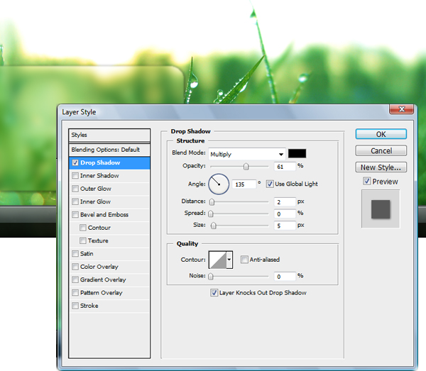
Paste the shape in the layer called "blur" and then apply a Gaussian Blur of 5px (Filter>Blur>Gaussian Blur). Then apply a Drop Shadow as shown below.
Step 8
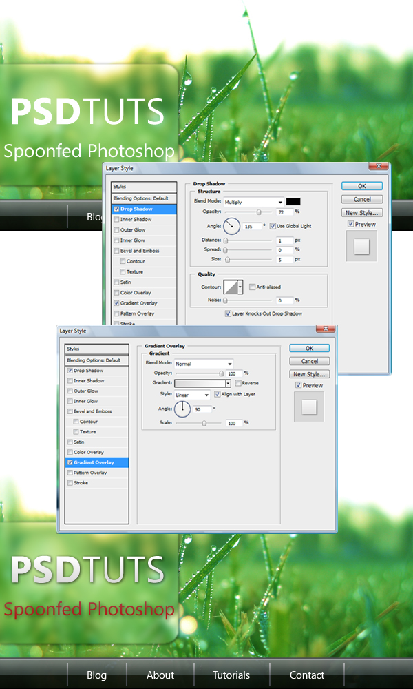
Now add your text inside the blur. Using the same typeface as the links (Segoe UI) type your name and tagline. Select some of the text and make it bold and keep some normal, apply a Drop Shadow, and a Gradient. This produces a modern-looking text that has a striking look.
Step 9
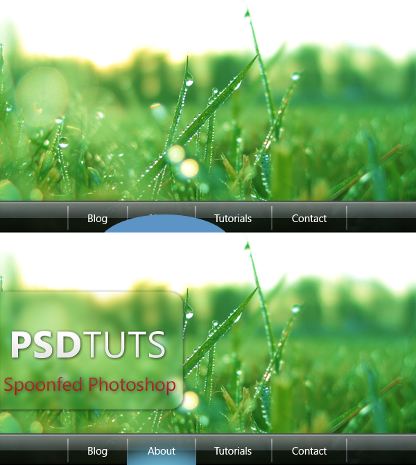
This step is optional, as it will produce the blue highlighted glow that will become our hover effect. Draw a large Ellipse (U) that fills the area between the dividers. Change the color of the ellipse to #5c94c5 and apply a Gaussian blur of 10px. The shape has now become a raster layer, and you can clean up the excess blur by using the Marquee Tool (M).
Conclusion
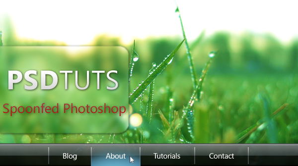
This menu produces a stunning effect when coupled with a bright scenic background. It uses transparency to great effect as well as modern gradients. The use of highlights is a great trick to providing a cutting-edge modern look to pictures. This menu would be quite easy to slice up and turn into a very functional web-based menu with hover states.
NOTE : ALL CREDITS FOR THE ORIGINAL TUTORIAL MAKER :)
=================================
=== For more tutorials keep visiting ;) ===
= http://photoshop-manic.blogspot.com =
=================================
No comments:
Post a Comment