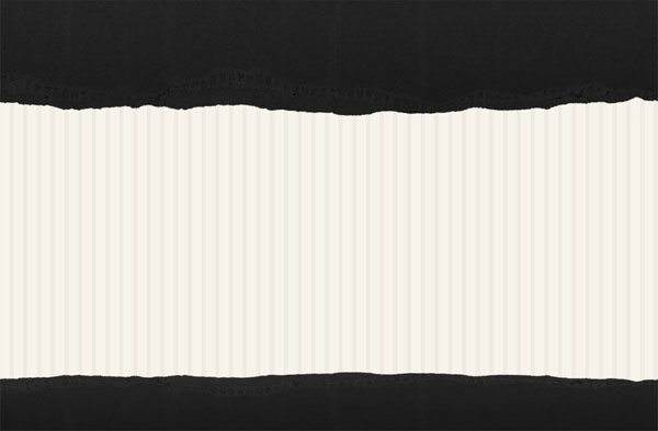
Final Image
This is the final image that we’ll be creating:

Images Used
The following images will be used in this tutorial:
Step 1
Open up a new document (20X900px). Select your entire canvas (option+a) and fill it with a light cream color (F6F3EA). Then use your rectangular marquee selection tool to create a thin, slightly darker line down the right side of your canvas. This bar should be EFEBE1 in color. Then go to edit>define pattern and define your pattern as ‘creamstripespattern’.

Step 2
Now create a new document (960X900px). Create a new layer called ‘background’ and fill your entire canvas with any color you like. Then go to blending options for this layer and apply a pattern overlay effect, selecting your newly created ‘creamstripespattern’.

Step 3
Now paste in a photo of some ripped cardboard. Position the cardboard in the top of your canvas and call this layer ‘header’. I cut out the photo from it’s original white background using the magic wand tool.

Step 4
Now go to image>adjustments>desaturate to grayscale your cardboard layer.

Step 5
Now go to blending options for this layer and apply a gradient overlay, ranging between very dark grays. Then reduce this overlay’s opacity to 90% to allow your cardboard to show through a little more. Then set your overlay’s blend mode to ‘multiply’.

Step 6
Now duplicate your header layer and call the duplicate ‘footer’. Go to edit>transform>flip vertical, and then move the flipped cardboard down to the bottom of your canvas. I chose to crop away the bottom of my canvas, making the overall layout less tall. Finally, to make my footer area thinner than my header, I go to edit>transform>scale and then reduce the height of my footer area.
Step 7
Now grab a radial gradient, ranging from white to transparent. Then create a new top layer called ‘header gradient’. Pull out your gradient from the top left of your dark header area.

Step 8
Now reduce your gradient layer’s opacity to 15%. Also part of the gradient is jutting out into your cream area, which you don’t want. Therefore select your header area and click beneath your header area using your magic wand tool (to select the cream area beneath your header). Then return to your gradient layer and hit delete.
This should give you a subtle highlighted effect in the top left part of your header.

Step 9
Now repeat the same step but in the center of your cream background area. To do this create a layer called ‘background gradient’ below your header/footer layers but above your main cream background layer. Then create a much larger radial white-transparent gradient ranging from the center of your canvas outwards. To measure exactly from the center go to view>rulers to turn on your rulers. To make the effect more subtle reduce this layer’s opacity to around 30%.

Step 10
Now type out some text for your logo, using the free font Museo. Apply the blending options shown below.


Step 11
Now to make a sleek logo icon. Start by making a rounded rectangle. Now create a smaller rounded rectangle above your main shape. Option+click on your layer in your layers palette to select all of your smaller shape. Then go to select>modify>contract and contract your selection by 4px. Then hit delete. This should leave you with a briefcase shape created by your two shapes.
Finally, right click on your logo font layer and click ‘copy layer styles’. Then right click on your icon layer and click ‘paste layer styles’.


Step 12
Now add some menu text. I went with Arial, at -50 kerning.

Step 13
Now type out some full stop marks multiple times to create dividers between your menu links. Once you’ve typed a line of dots, go to edit>transform>rotate 90 clockwise. Then duplicate this layer each time you want another menu divider.

Step 14
Add some text to your footer.

Step 15
Paste in a thumbnail of a website that you want to display in your portfolio. Then go to edit>transform>scale and resize it to fit into your cream area. Then go to blending options and apply a stroke effect.


Step 16
Add some text to the left of your thumbnail. Be sure to give plenty of line padding, and keep your text nice and dark to give contrast against your light background.

Step 17
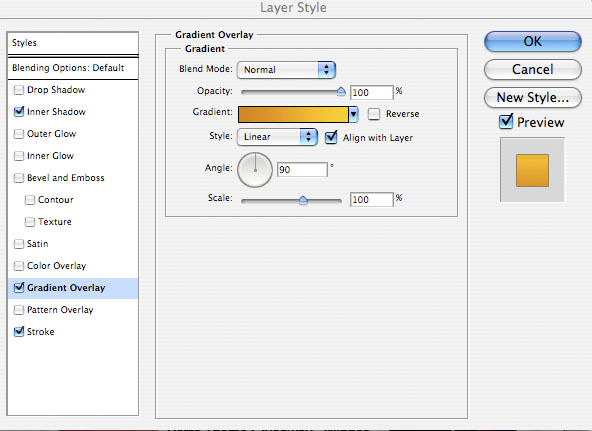
Now create a button using your rounded rectangle shape tool. Then apply the blending options shown below:


And We’re Done!
I really hope that you enjoyed this tutorial, and as always would love to hear your comments.
You can view the full sized version by clicking on the image below:

NOTE : ALL CREDITS FOR THE ORIGINAL TUTORIAL MAKER :)
=================================
=== For more tutorials keep visiting ;) ===
= http://photoshop-manic.blogspot.com =
=================================
No comments:
Post a Comment