Introduction
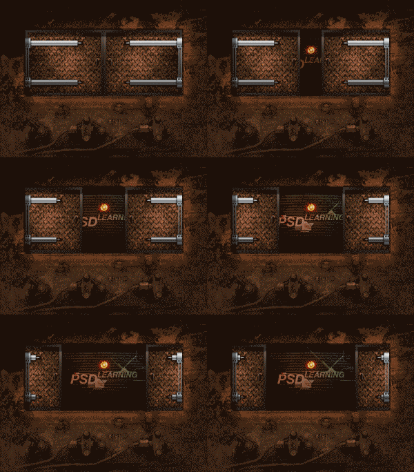
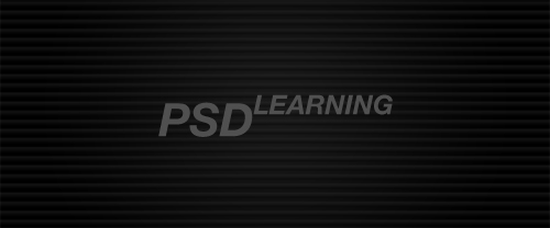
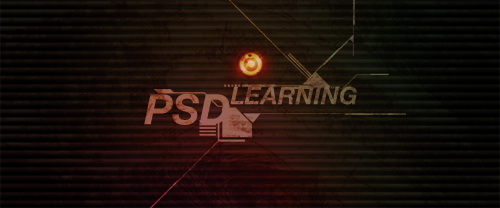
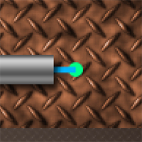
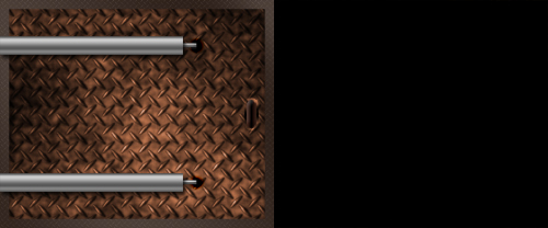
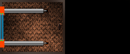
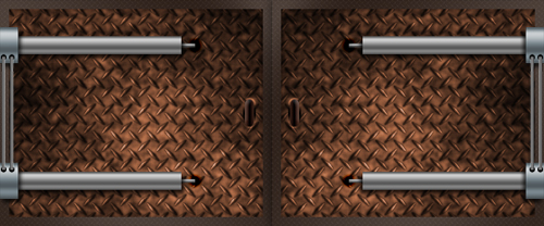
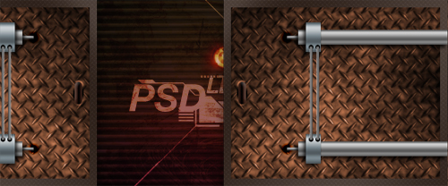
Before we go any further, I’ll first mention that some of the things we will be using are native only to Photoshop CS3 extended, but most of the techniques can be used in any version and the tutorial will be helpful no matter what version you use. I have wanted to write this tutorial for a while as there are very few tutorials which have even mentioned smart objects or video layers and I think it is time we tackle them. Unlike a lot of tutorials this one will focus on techniques and learning and I have tried to explain everything in detail. I based this tutorial around the creation of a simple grunge interface and have walkthrough most of the steps but if you have some good knowledge of Photoshop then try creating your own unique interface and use the techniques I’ve shown. Although I’ve gone into a lot of detail, I wont explain things like how to create a new layer etc. but try some other tutorials on PSDlearning if you really are a beginner. Below is the animation (reduced size and quality) that we will create through this tutorial.

Step 1
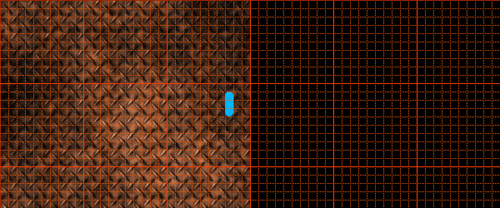
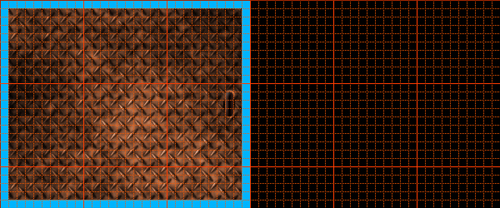
Before we start on creating the actual image we are going to make a couple of patterns which we will use later on. Patterns are a really efficient way to work in Photoshop when you are wanting to have images that can repeat endlessly, it’s useful to learn how to create your own patterns so here we will learn how to make patterns that are seamless when repeated. If you look at the final image you’ll see that I used a diamond plate effect on the doors, this could be done by using a stock image but I decided it would be a good idea to make a pattern for it. This would mean that we control the shadows and highlights and also that we can make it repeat over an infinite area. Start by creating a new document with dimensions; 40×40px, next go Edit>Preferences>Grids and set the major gridlines to every 40px and the subdivisions to 8 then hit OK. If the grid is not showing then turn it on by hitting Ctrl+’. click on the view dropdown and make sure Snap is checked. Create a new layer, now we are going to create some guidelines for the pattern so grab the line tool with a weight of 1px and draw 45° lines like shown in the image below, make sure that in the main toolbar Fill Pixels is selected and anti-aliased is unchecked.

Step 2
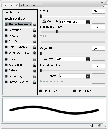
Select the brush tool and choose an 8px hard brush then hit F5 to bring up the brush editor, in shape dynamics change the settings to match the ones shown below. This means that when we stroke a path and simulate pen pressure then the brush will change to 2px at each end.

Step 3
Create a new layer then grab the pen tool and in the main toolbar make sure paths is selected. Now, snapping to the grid, click at the start point of the middle line we made then again at the end point. right click anywhere in the canvas and select stroke path, make sure simulate pressure is checked. THe image should now look like the one shown below.

Step 4
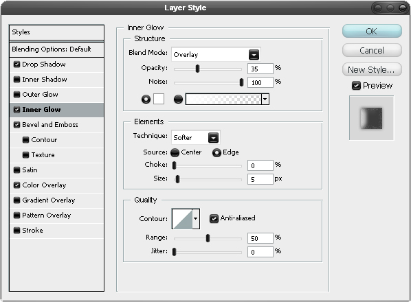
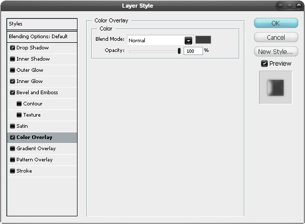
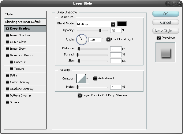
Right click on this layer and select blending options, us the settings shown below to add a drop shadow, inner glow, bevel and color overlay. This will give it a more realistic appearance. Note that I’ve added 100% noise to the inner glow, this creates a rougher effect as if it has been worn down or rusted.


Step 5
Next duplicate this layer then go Edit>Transform>Flip Vertical, note how the layer styles will not flip but will adapt to this change, keeping the lighting consistent. Now create a new layer below the duplicated layer then select the duplicated layer and hit Ctrl+E. Next go Filter>Other>Offset and use the settings shown below. The offset command is one of the most useful commands when creating patterns in Photoshop

Step 6
Now hide the Background layer and also the layer with the lines we used as guides, by hiding the Background layer we are making this transparent. Next go Edit>Define Pattern and name it as diamond plate. You can close this document now.

Step 7
We are going to create a pattern that will look a bit like corrugated metal when repeated. Create a new document with dimensions; 10×10px, then edit the grid settings to achieve a grid like the one shown below with 10 subdivisions. Create a new layer then use the rectangle tool with a foreground color of black to achieve this result.

Step 8
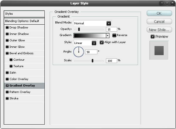
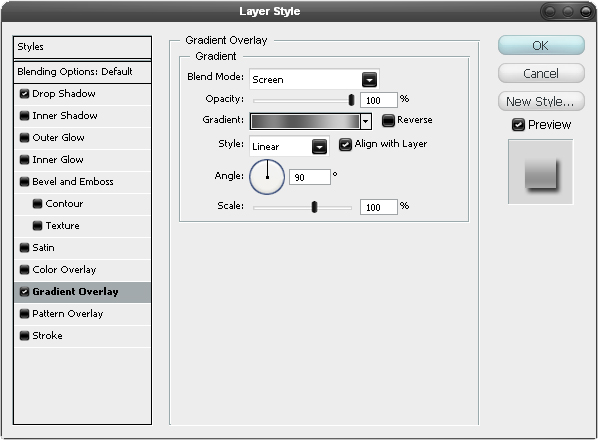
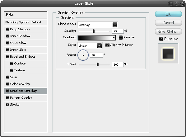
Now go into the blending options of this layer and add a gradient overlay using the same settings as shown below. Next hide the background and then define the pattern in the same way as we did before then close the document.

Step 9
Now we will start on creating the background; the part that is shown when the doors open up. Create a new document with dimensions; 600×250px, the reason that I used I small image size is just because working with video is quite demanding on on your computers memory and wanted this to be followable for anyone. First fill the background layer black, next create a new layer then use the gradient tool to make a radial gradient going from white in the middle of the canvas to black at the edge of the canvas. Change the opacity of this layer to about 10%, this will make the middle of the canvas slightly lighter.

Step 10
Now we are going to add the corrugated metal effect, there are a few different ways to add this but I feel the best way to do it is to add a pattern overlay to a layer of the correct size which in our case is the full document. Create a new layer then fill it with black, a quick way to do this would be to hit D then Alt+Backspace; this resets the foreground and background colors then fills the layer with the foreground color.Select this layer then in the layers panel change the fill opacity to 0% and the opacity to 50%. Next open the blending options for this layer then use the pattern overlay settings shown below, choosing the corrugated metal pattern.

Step 11
Now select the text tool and create some text in the middle of the canvas, I used Helvetica Bold Italic, 72pt and a color of #505050 for the text but feel free to use something different or even use your company’s logo.

Step 12
Now we are going to add some video to our image, later on in the tutorial I’ll show how to make video in Photoshop but first We’ll just add some which have already been made. The videos used here are from GoMedia’s Arsonel who provide some free motion pack samples as well as some other cool stuff. We will be using the Tech Shape Motion Pack which can be downloaded here. Create a new layer group named movies which will hold the movies we are about to add. Go Layer>Video Layers>New Video Layer from File then choose one of the movie files you downloaded; I used techshape8.mov. Now go Window>Animation and a timeline should pop up with the layer stack on the left side, all except the video layer should have an infinite time. Drag the time slider to just before the end of the video layer, you should see the shape has now appeared in the docment window, now that we can see it, it will make it easier to work with.

Step 13
Right click on the video layer in the layers panel then select Convert to Smart Object, if you havent come across smart objects yet then what they are is basically a separate Photoshop file storing the before converted information. So try this; create a new document then paste in an image, now convert this to a smart object, try now scaling it down loads, now try scaling it up; you’ll notice that it isn’t all pixelated in the way it would be if you hadn’t converted it. This is because when we converted it we actually made a new file which contained this image in it’s original state so it refers back to that file whenever we make a change. Next try clicking on the thumbnail of this smart object, this will open up the file containing it, try making a change to this file like altering the hue or desaturating it then save and close this, if you go back to the other document you’ll see that the smart object has been updated, very smart. Smart objects can contain muiltiple layers as well and one of the best parts of smart object are the smart filters, whenever you apply a filter to a normal layer it is permanent so you can’t go back and change it. However when you apply a filter to a smart object it now lets you back and change the values of the filter, the opacity and even the visibility in the same way as you can with layer styles. This now means that whenever you are wanting to apply a filter, you’ll nearly always want to convert it to a smart object first. I’ve given you a brief introduction to smart objects but I’ll show you more stuff throughout the tutorial and if you opened any new documents to test smart objects then you can close them as we are now back over to the tutorial. Okay now hit Ctrl+T to enter free transform mode, scale, move and maybe even rotate to get your video layer in the correct position.

Step 14
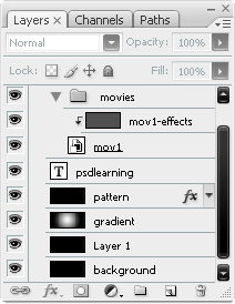
Now we are going to change the color of the video layer, we can either add a color overlay to the layer or create a new layer with a clipping mask to the video layer, I usually prefer to use the clipping mask method and keep the original file untouched. so create a new layer directly above the video layer and fill it using the same color you used for the text. Now hold Alt and click between these two layers in the layers panel to add a clipping mask. Your layers panel should now look similar to the one shown below.

Step 15
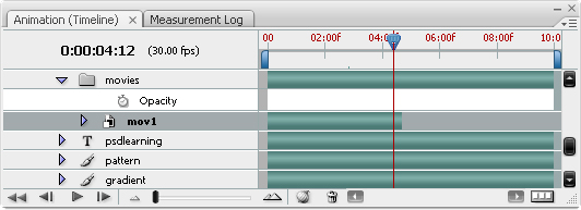
I now did exactly the same with another of these movie files, feel free to use more than two from this pack if you want. Now in the animation panel you’ll see all the movies you have added. We don’t want these animations to start immediately so drag each of the video layer bars to around the 2:00f mark like shown in the image below.

Step 16
I wanted a slightly rusty feel to it, so do this by copying and pasting this image into a new layer above the movie layer group. Set the blending mode to overlay and the opacity to 40%. Next create a new layer and fill it with black then set the opacity to 0%. We will use this black layer to give the appearance of a flickering light.

Step 17
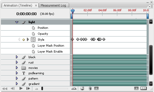
To create the flickering effect, open up the animation panel and fine the black layer we just created, within it there should be three properties; position, opacity and style, it shouldn’t be too hard to figure out what these do. Here we will use the opacity property so drag the time slider to the start or just click the first frame button in the bottom left now click the stopwatch button next to opacity and this should automatically create a keyframe. drag the slider along to about 1:00f then click the yellow diamond next to the stopwatch to create another keyframe. The opacity for all these frames is still 0%, now to make it flicker. move the time slider along a tiny bit then in the layers panel raise the opacity of the black layer up to about 60%, move along a small bit more then change the opacity back to 0%. This should make the light flicker if you try playing back the animation. Keep doing this about five or six times. Below is what my animation panel looked like.

Step 18
Next I added a red alarm light; this can be found here, scale it move it into position.

Step 19
The edges are a bit hard on this image so click on the layer mask button to add a layer mask to this layer then grab a soft brush with a 40px diameter with black as the foreground color, now hit 3 to change the opacity of the brush to 30% then brush round the image on the layer mask, this will hide the parts that you brush onto.

Step 20
I wanted to make this light flash and flicker as well so I thought the best way would be to add a color overlay to the layer with black as the color. Use the settings shown below.

Step 21
We’re going to use the same method as we used in step 17 except this time we are working with the style property so to make the light darker we are raising the opacity of the color overlay, again play the animation to test it and you wont need to go further than the 5:00f mark as this is going to be the length of the animation.

Step 22
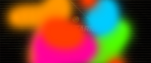
Create a new layer then select a large soft brush with 100% opacity, choose a bright color and paint some brush strokes onto this layer in different colors like in the image below.

Step 23
We are now going to add a filter to this layer so a good idea would be to convert it to a smart object. Now go Filter>Blur>Gaussian Blur and use a value of 100px. You can now go back and change this value at any time. Set the blending mode to color and the opacity to about 60%. We have now finished the background so try playing the animation to see how it looks.

Step 24
Before we go any further it would be a good idea to put all the layers that you have at the moment within a group named background. create a new group named diamond plate then create a new layer within that and convert it to a smart object immediately. Add a color overlay with the settings shown below.

Step 25
Now we’ll add some smart filters to this, first go Filter>Render>Clouds then Filter>Noise>Add Noise and use 50%, gaussian, monochromatic then go Filter>Blur>Gaussian Blur with 2px. You should now have something which looks similar to the image shown below.

Step 26
Now we’ll add the diamond plate patern so first duplicate the layer we made in the last step then get rid of the color overlay and add a pattern overlay and mimic the settings I used.

Step 27
In the layers panel add a levels adjustment layer and drag the grey slider to about 3.

Step 28
Now add a hue/saturation adjustment layer and set it colorize and use a hue of 20 and a saturation of about 45, it should now look like the image below. Put all the layers that make up the diamond plating into a new group called ‘diamond plate’. Turn the grid on; I used a gridline every 100px with 10 subdivisions. NOw use the rectangular marquee tool and drag a box from the top left corner to the bottom middle then select the group and click the add layer mask button in the layers panel.

Step 29
The next few steps will be fairly similar and if you’ve done any sort of interface design before then you should be familiar with the techniques, I wanted this tutorial to focus more on the video layers and on techniques so I have only created a quick design for this part but with the techniques I’m showing here you should easily be able to create some more detailed and complicated ideas. We will go through two main steps for each element; the first will be creating a new layer then a simple shape, when creating the shape you can either set it to fill pixels or shape layer, it wont make much difference, note that although I show the shapes in a bright color, I actually used black for all the shapes and I only did this so you could see it better. The second step is to add some layer styles to the shape which I’ll go through, one thing which is important to understand when using layer styles is that the name of each effect like drop shadow is to be taken only as a suggestion, for example drop shadow can be used to create effects like glows and even strokes. First we’ll make a handle, use the rounded rectangle tool with a radius of about 8px. Note that I’ve hidden the background group for the time being.

Step 30
Set the layer styles shown below to finish off the handle, below I’ve shown the final handle.


Step 31
Select the rectangular marquee tool and draw the outer sides of this border making a selection, next, still with the rectangular marquee tool, hold Alt and draw another selection one minor gridline inside the previous one. Now fill this selection black.

Step 32
Again use the blending options shown below, note how I used a scaled down version of the diomond plating; this was to add a bit of texture to this border.


Step 33
Now use the rectangle tool to create the two cylinders, make sure you create each one in a different layer.

Step 34
Add these layer styles to both the layers by doing one then right clicking on the layer and selecting copy layer style then pasting the layer style onto the other one.


Step 35
In a new layer draw a box like the blue one shown below, only in black then do another one for the other cylinder. Do the same for the circle shown here so these should take up four layers.

Step 36
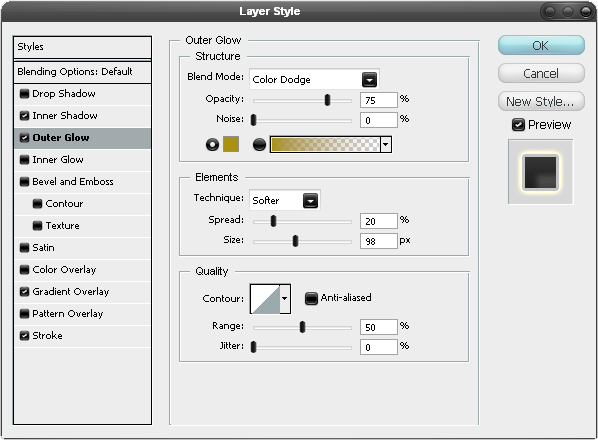
For the circles, add the outer glow shown below which will make it look like rust. Now for small cylinders, copy the layer style from the large cylinders then delete the drop shadow and add the bevel shown below. Feel free to play around with any of these settings.


Step 37
Put all the elements that we just added as well as the diamond plate group into a new group called ‘moving’, this is the group that will contain all the moving parts. Now create a new group above this called ’stationary’, you should now have three layer groups; background, moving and stationary. I next created some elements within the stationary group using the same techniques as before. Below I’ve shown where I created the shapes and what they looked like after I added the styles. For most of it I just copied layer styles from previous elements and kept it simple.


Step 38
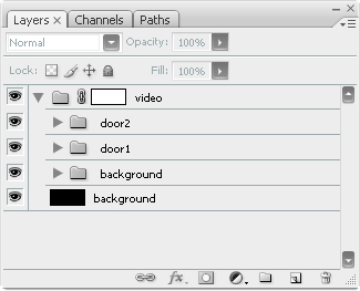
Now double check that your layers are arranged properly because we are going to convert them to smart objects. Right click on the moving layer group and convert it to a smart object then do the same for the stationary smart object. Now if you want to edit any part of this then you can by double clicking on the thumbnail and it also makes your layer panel look less cluttered less cluttered. Lastly put both these smart objects within a new group called ‘door1′. The reason why we made a smart object out of these is because layer groups cannot be animated in the way we want to animate them so converting was necessary for the moving group.

Step 39
Duplicate the door1 group then change the name of this one to ‘door2′, select the door2 group then hit Ctrl+T to enter free transform mode, drag the pivot point, the small circle in the middle, over to the very middle of the document, use the grid to assist you.

Step 40
Go Edit>Transform>Flip Horizontal, now you should have two doors, Move the second one over so the image is symmetrical.

Step 41
Open up the animation panel if its not already. Find the door1 moving smart object, see the image below. What we want to do is create a keyframe at the start when the door is closed then create another one at about the 5.00f mark when it is closed. Click the first frame button then the stopwatch next to position to set the first keyframe. Now drag the slider to just before the 5.00f mark.

Step 42
Select the smart object in the layers panel then hit V to choose the move tool. Holding Shift move the door to the left like so. After moving it a keyframe should automatically be created for you.


Step 43
Now do exactly the same for door2. If you try playing your animation now then you’ll notice that it goes on a bit too long so shorten it by dragging the end work area slider to the left like shown in the image below and make sure your not cutting off any of your animation.

Step 44
Wouldn’t it be good if we had this video as a single file that we could put in any project but still have it fully editable if we want to go back and change something, well we can by using a smart object because since the smart object will store the whole file, it will also store the timeline as well. There’s a couple of things we have to do first though. To start with, double on the background layer and this should unlock it then create a new layer group called ‘video’, now hit Ctrl+A to make a selection around the full canvas then select the layer group you just made and press the layer mask button in the layers panel. Select all the layers and drag them inside this new group. The reason we needed the layer mask is because some image extend outwith the document boundaries which causes a problem if we were to put this in a bigger canvas as these parts would show. Now just convert the video group to a smart object.

Step 45
Now you can copy or drag this smart object into any document, I quickly made an environment to place this in and decided to give you a quick idea of how I did this. I made a new document with dimensions; 500×380px and below I’ve shown the six layers I used and the blending modes and opacities. The bottom layer is the background layer which is filled black, the next is some clouds which I tend to use in a lot of projects but never really at above a 10% opacity, here I used 5%. The next layer is a very good grass texture which can be found here and I used just to add a bit of roughness to the image. The next was a rust texture that you can find here. Then I added this image and used a layer mask to blend it in. Then some soft terracotta colors to add a bit off color to the image. Feel free to experiment here.

Step 46
I then dragged the video smart object into this document and moved and scaled it a bit. Lastly I added some layer styles to this to make it fit into the background a bit better, I’ve shown them below. This is where the tutorial ends, there is a couple of options now, you can save the image as an animated gif by going File>Save for Web and Devices or you can export it as a movie file by going File>Export>Render Video. If your using the animated gif on a web page you would definitely be better to place it directly on top of an image of the first frame of the animation, this way you wont be left with a blank space while the animation loads.


Conclusion
Hopefully you’ve learned a lot throughout this tutorial and have seen how powerful smart objects can be. You’ve also learned that you can create videos and animations easily without having to learn Flash or andy video editing software. Video layers are something which I’m sure will be developed a lot in Photoshop CS4 so it’s a good idea to start learning it now.


 is selected in the toolbar. Draw the following shape:


![]()

