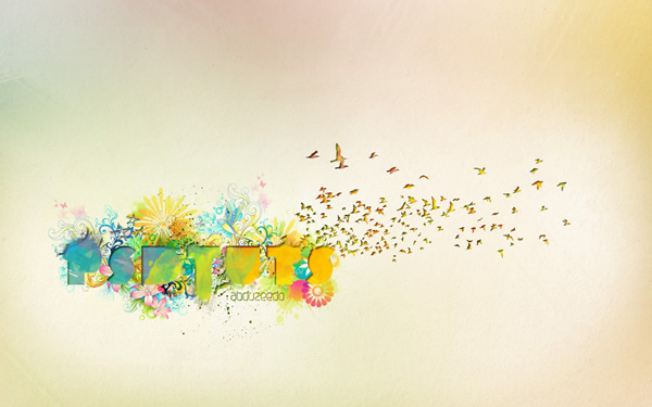
Final Image Preview
Step 1
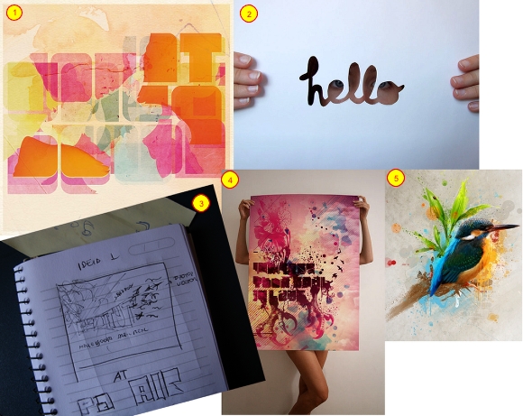
The first step here is actually the first step in all my projects. I look for references images based on my sketch. This research and planning process is intertwined. It allows me to look through various elements and plan the direction to follow. Of course, I can change the direction during the creation as this process is fluid. So I found multiple images with effects I really liked and wanted to apply to a design (images: 1, 2, 4, and 5). Then I put some ideas on paper (image 3), added my own direction, and developed my concept.
Step 2
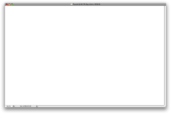
Create a new document in Photoshop, I used a wallpaper size of 1920 pixels by 1200 pixels.
Step 3
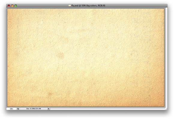
Download the Bleeding Dragon Oldpapers textures, and place the Paper 2.jpg in your document.
Step 4
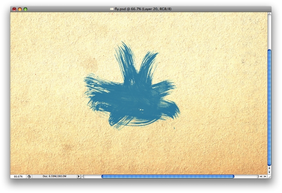
Now let's use some brushes, in this case the fantastic Bitbox set of watercolor brushes. Go ahead and download these watercolor brushes. Bitbox has some other amazing watercolor brushes as well, so feel free to test different ones as well.
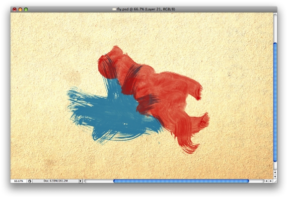
So, let's select the Brush Tool (B) and blue for the color. Create a new layer, then with just one click paint place some paint on the layer.
Step 5
Create a new layer, select a different brush and use red for the color. Once again paint the layer. Also you can try different Blend Modes, in this case I used Normal but you can try Multiply as well.
Step 6
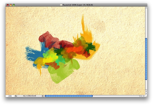
Create more layers and paint each layer with different colors. Use yellows and greens and different blend modes as well. Try to reproduce the image below.
Step 7
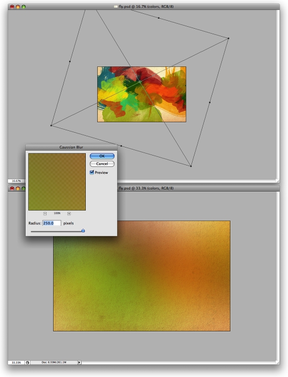
Group all the layers with watercolor brushes and duplicate the group. You can hide one. With the other layer go to Layer > Merge Group. Rescale the layer and make it bigger, as in the image below. Then go to Filter > Blur > Gaussian Blur, and use 250 for the value. Now change the Blend Mode to Multiply.
Step 8
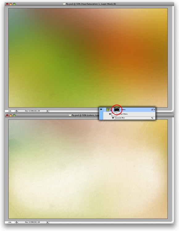
Go to Layer > Layer Mask > Reveal All. Select a big round brush and change the hardness to 0%. Choose white for the color and paint over the layer mask to hide some areas of the layer. Mainly in the center.
Step 9
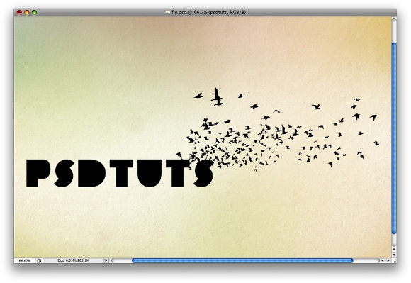
Write the text you want, for the typeface I used a P22 font called Constructivist. You can use the one you like the most. Just make sure that it's really bold. Also, I placed some birds I got from the GoMedia's Arsenal (Set 5). The pack is called Flock of Birds, but I'm sure there are brushes with birds like that you can search on the web for.
The main idea here is make the birds coming from the text. That's why I placed them over the S and a bit on the T.
Step 10
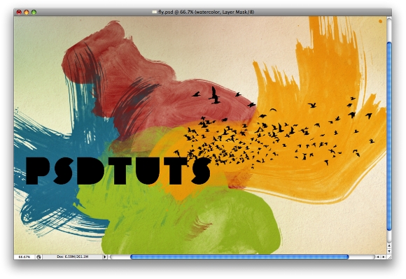
Again, let's use that group of layers painted with the watercolor brushes we hid on the Step 6. First, use a big version, as in the image below. Rename the group to "Watercolor Big" and change the Blend Mode to Multiply.
Step 11
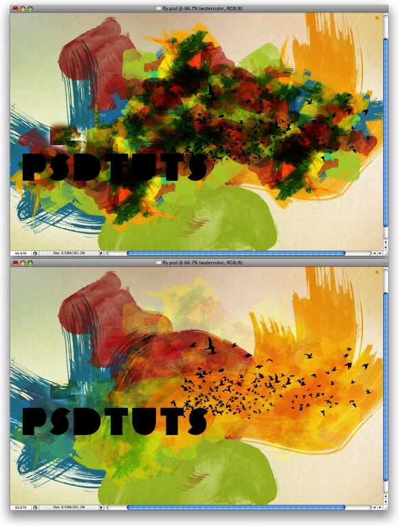
Duplicate the group several times. Change the Blend Mode to Multiply for each copy. Then select all new copies and merge them in one unique layer. Just go to Layer > Merge Layers. After that change the Blend Mode to Soft Light, rename the layer to "Watercolor Small," then group it with the "Watercolor Big" group. Rename this new group to "Watercolor."
Step 12
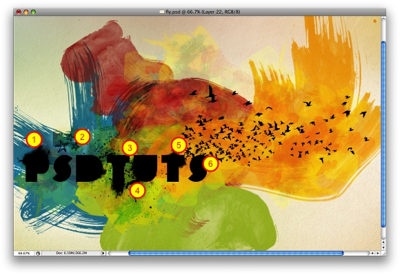
Here let's add more elements to our design. Use some brushes and paint over some letters (1-6). I used some Brushes from Brusheezy: 1, 2, 3, 4. Make sure you paint in black and with small brushes.
Step 13
Merge the layers with the text, the birds and the brushes with the splatters and other details. Go to the Layer palette, then hold down the Command Key and click on the thumbnail of the layer you have just merged. That will create a marquee selection, as in the image below. Now select the "Watercolor" group and go to Layer > Layer Mask > Reveal Selection.
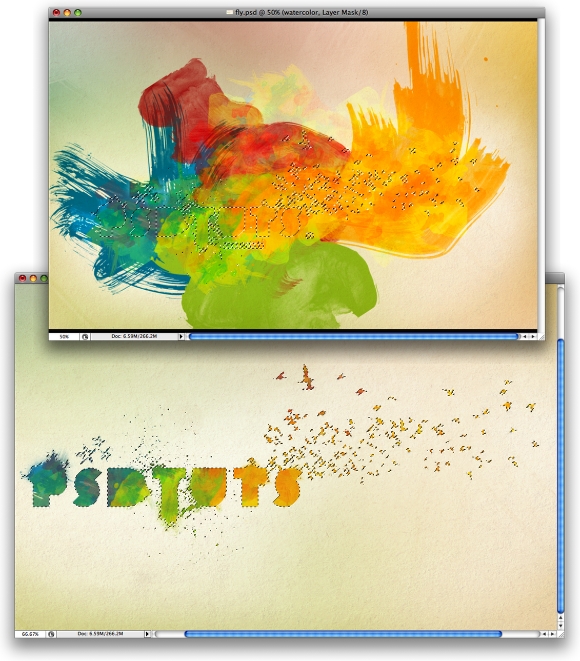
Step 14
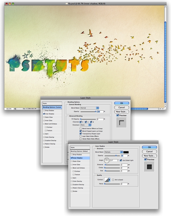
Duplicate the group we have just used on the previous step and go to Layer > Merge Group. This layer has to be beneath the "Watercolor" group. After that go to Layer > Layer Style > Blending Options. Change the Fill Opacity to 0%. Select Inner Shadow and change the Blend Mode to Multiply. Use 75% for the Opacity, 5 pixels for the Distance and Size, 130º for the Angle, and Choke set to 0.
Step 15
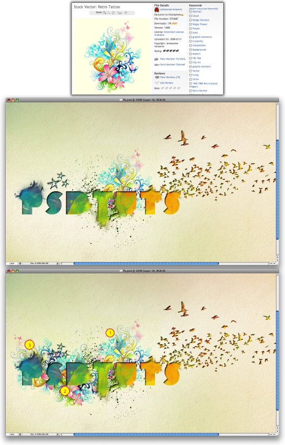
Here I used one image of a linear floral design from iStockphoto. Place it in your design and change the Blend Mode to Multiply. This layer has to go beneath the watercolor layers. Duplicate the layer twice. Rotate and place them behind the D,, P, and S. Use the image below as a reference.
Step 16
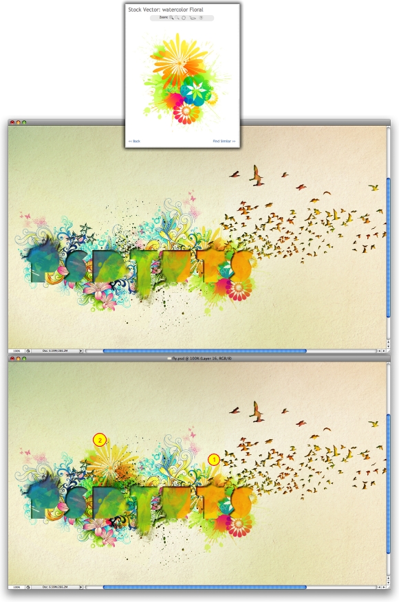
Let's add more vector elements, I used another image from iStockphoto, this time of floral elements. Place the new image in your design and repeat the same thing as the previous step. This time let's use just two copies.
Conclusion
Now you can add your logo or some text to finish the design. The idea of this tutorial is to show how to create a design from multiple reference images, a simple sketch, and your own ingenuity. Using vectors and images from stock sites allows you to create quick and attractive results with relatively simple steps. You can view the final image below or view a larger version here.
No comments:
Post a Comment