Step 1
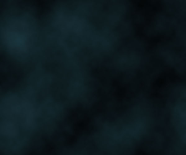
The first thing we need for our image is a background. We're going to use a quick star-sky background. There are lots of tutorials around for this effect, and it's actually a simple two-step process: clouds + noise.
So on a new blank canvas, start by choosing a dark blue color - #18323a - and black and then go to Filter > Render > Clouds.
Step 2
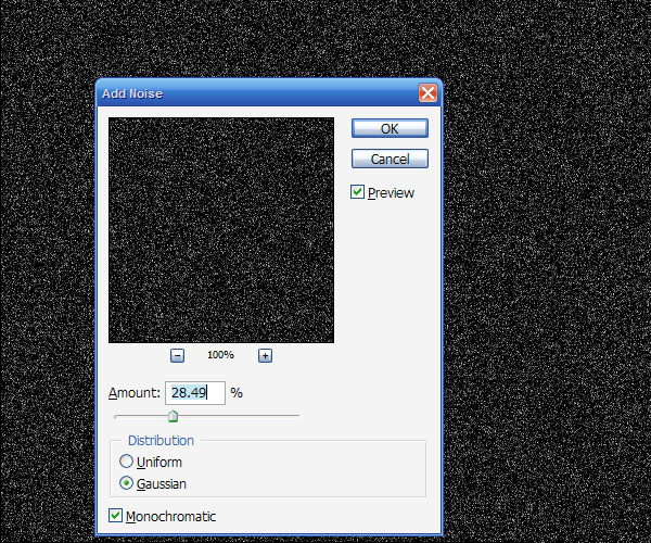
Now create a new layer, fill it with black, and go to Filter > Noise > Add Noise and use values roughly as shown below.
Step 3
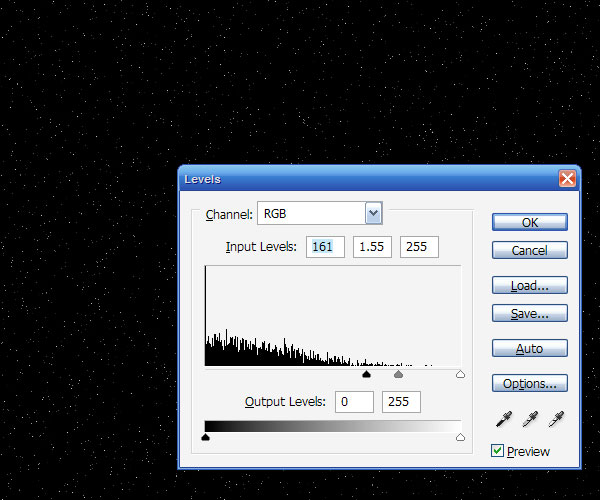
Now that is way too much noise, so go to Image > Adjustment > Levels (or Ctrl+L) and bring those sliders together until you see most of the 'stars' vanish as shown.
Step 4
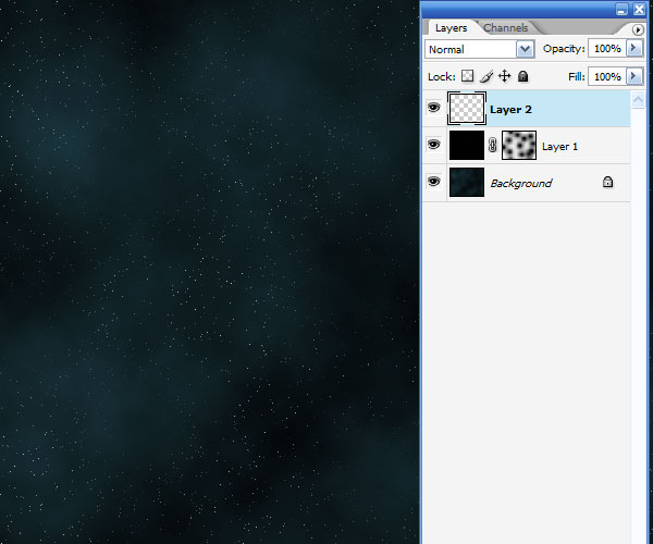
Now set the stars layer's blending mode to Screen so that the black vanishes and just the stars remain. It's still a bit too even though, so add a Layer Mask to the layer, and with a large fat brush just mask out blobs so that it seems a little less even. See the screenshot below to see the layer mask I added...
Step 5
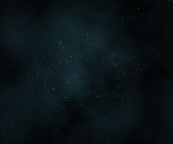
In this step, I added a radial gradient layer going from the white in the center to black at the edges and set the layer to Overlay and 45% Opacity. The effect is just to darken the edges and it's not an essential step. In any case you should have something like this image shown below.
Step 6
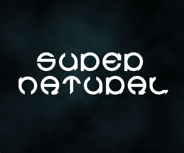
Now we add our text. I've used a font called Cuez_Ver6 which looks suitably strange. If you go to a free font site and look under sci-fi or the like, you'll doubtless find something similar. Actually it's quite unreadable really (especially the r), but who cares, it looks cool!
Step 7
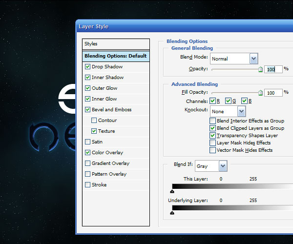
Next we're going to add some layer styles. You can get a sample PSD file at the end of this tutorial, but because we're switching to a pay system for the samples, I'll go through the settings in case you don't want to buy the file.
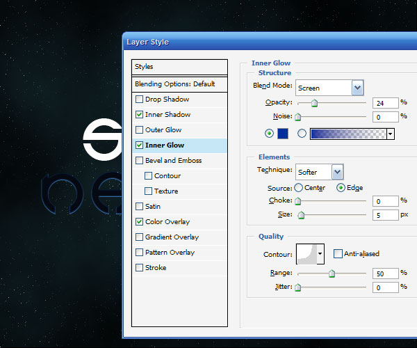
First I've given the text a Color Overlay of straight black (#000000). Then because the basis of this text effect is a creepy light, I added inner glows. First an Inner Glow as shown below, and then an Inner Shadow with color #54a4ff, blend mode Screen, distance 1, size 2, angle -90', and everything else default.
Step 8
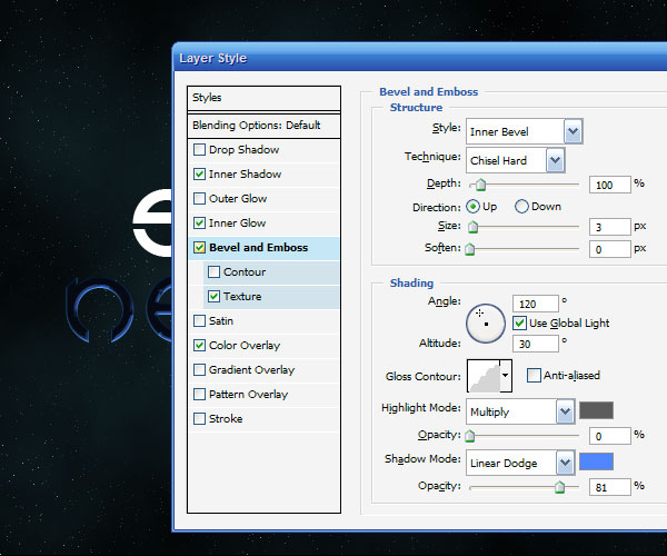
Next we use a textured Bevel and Emboss to give the style some unevenness. You can see the Bevel settings below. The Texture I added is just one of the standard ones that comes with Photoshop that looks like bubbles. And I set the Depth to -79.
As you can see below, this makes the inner glow look a lot more uneven.
Step 9
Finally I added a Drop Shadow and Outer Glow, both set using Screen and the color #008ac5. I used both so that I could make one of them a small glow and one a really spread out glow, so the distances were 10px and 100px.
Step 10
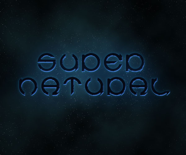
Ok, so here's our text with the Layer Style applied. It's off to a good start, but you can only do so much with Layer Styles, so now we do some good ol' manual effects.
Step 11
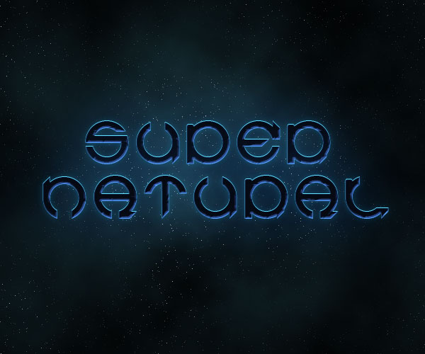
First of all, duplicate the text, right-click the layer, and remove the layer styles. Then change the color of the text to a fluorescent blue (#5cdbff). Then press the up arrow once to move it one pixel up. This will give a sort of glow effect as shown below.
Step 12
Ok, this next step is the key step in this tutorial.
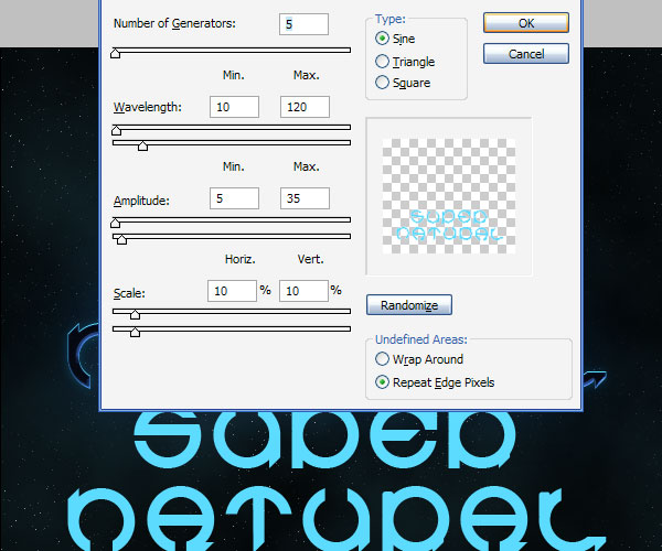
Duplicate the text layer with the fluoro blue color. Then go to Filter > Distort > Wave. You can use mostly the default settings, except where it has Scale. I've set this to just 10% and 10%. This will distort the text, but only a little bit. If you leave it at 100% the effect is pretty full-on!
(Note: In the image below, I moved the text down so that it would be clear that I was applying the wave filter to it.)
Step 13
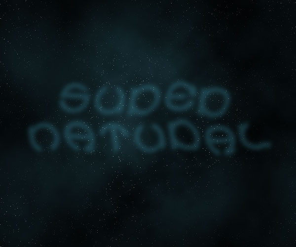
After you have distorted text, go to Filter > Blur > Gaussian Blur and use a value of 4px. Then set the Opacity to 20%.
In the screenshot below, I've switched off the main text so that you can see the distorted text.
Step 14
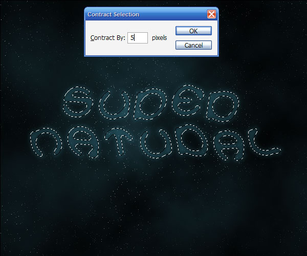
Now hold down Ctrl and click on that text layer to select it's pixels and then go to Select > Modify > Contract and use a value of 5px. Then press Shift+Ctrl+I to invert the selection and hit Delete. This should leave a thin wispy looking remnant of your text.
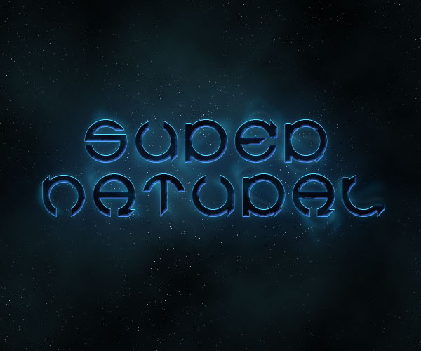
Now switch on the main text layer, and it should look like a tiny bit of smoke coming off the letters.
Step 15
Now duplicate that layer and go to Filter > Distort > Wave and distort this copy even more.
Now repeat this step a couple of times and vary what you do with the wave. So you might want to press Randomize sometimes, or sometimes distort the copy a few times. Also I used a mix of blending modes on the different copies of the smoke. Two of them I had no blending mode set, two of them I used Overlay, and for another two I used Hard Light.
Also it's a good idea to mix up whether they are behind or in front of the text. Remember you want the effect to look like wisps of smoke coming off the letters.
Step 16
Now that we have our small smoke sorted out, it's time to add some bigger wisps.
So again duplicate the fluoro blue text layer.

Step 17
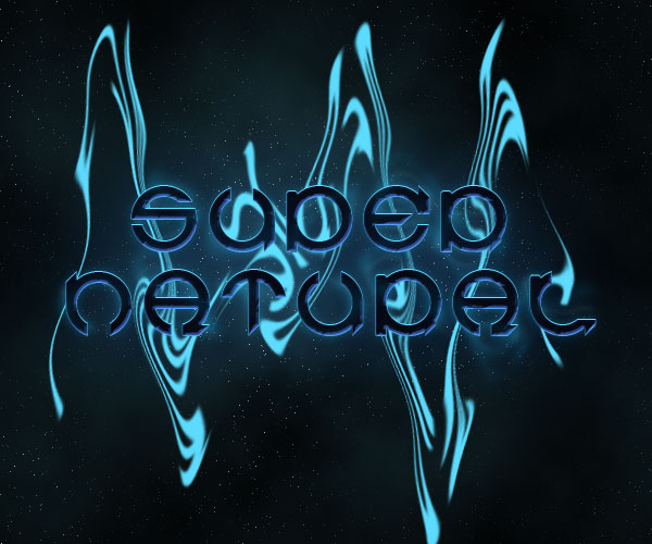
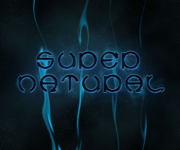
We now apply another Wave distortion, but this time where it has Scale, set the horizontal to 5% and the vertical to 100%. This will make the shapes become very elongated as shown. Once you've applied the wave, just repeatedly hit Ctrl+F to keep doing it over and over again until the text has been completely distorted into long wispy shapes.
Step 18
Once you have a good smoky-looking effect, set the layer blending mode to Hard Light and you should have something similar to the image shown below.
Step 19
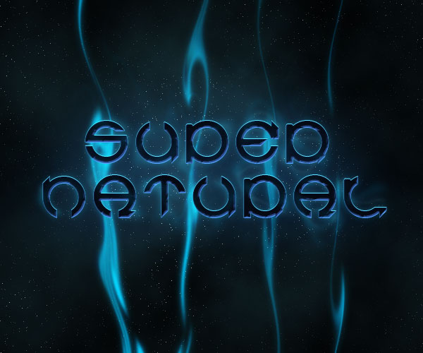
Now duplicate that last layer and run a Gaussian Blur by going to Filter > Render > Gaussian Blur with a value of 4px. This will make our layer look a little softer.
After that, get a large soft eraser brush and just brush away some of the bits at the bottom and top so that it fades off as it approaches the edges.
You may also want to repeat these last couple of steps to add more wisps.
Step 20
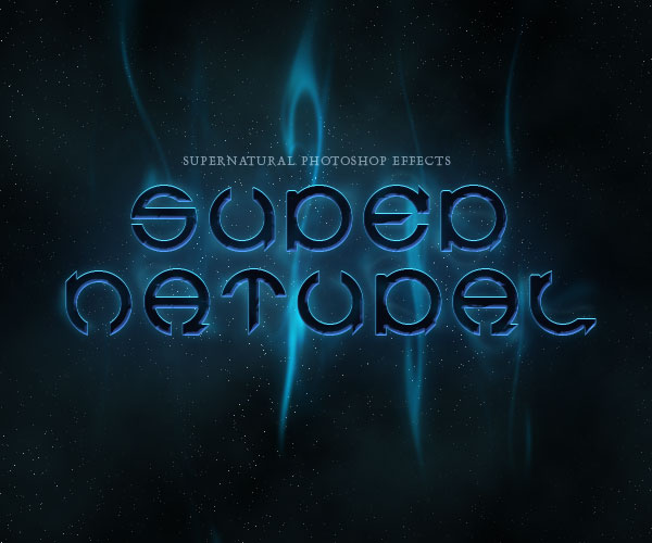
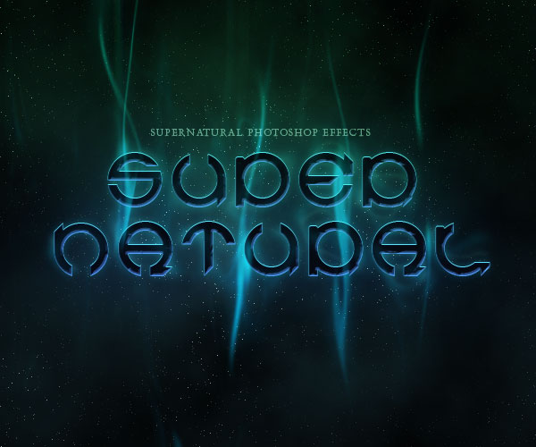
Here I've removed the bottom of those wisps and added a few more subtle copies. Also I added some extra type above the main text just to make it look a bit cooler.
Step 21
Next I moved one or two of the wispy layers in front of the text so that it looks like the smoke is trailing over the letters. In particular look at the E in super to see what I mean.
Step 22
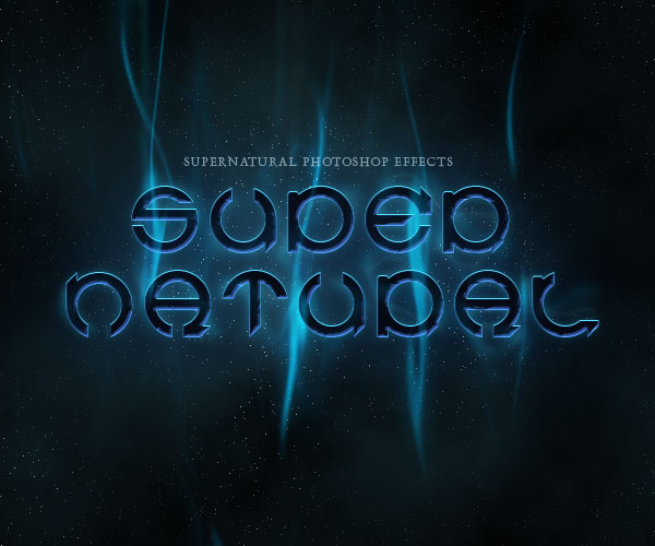
Finally, to give it a more eerie feel I added a layer above all the others and with a large brush painted some green on top, then set the layer blending mode to Color to make it so that the image is a blue-green coloring. And we're done! One slick, smoky effect!
No comments:
Post a Comment