Step 1:
BACKGROUND LAYER
We start as always with a background gradient. I've used a Radial Gradient with two shades of the exact same brown that this site uses. The exact color codes are:
Foreground color - #2f2520
Background color - #1e1916

Step 2:
Now in a nice delectable green, we write a word. I've written 'Jelly' and used the font "Gill Sans Ultra Bold." Bolder fonts are good for this sort of effect because there is more room to actually do stuff with the styles.

Step 3:
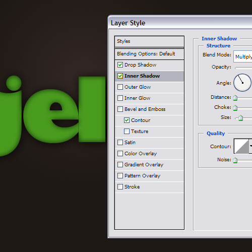
So now we right-click on the layer and choose Blending Options to start adding styles. First we add a drop shadow to lift the letters off the background and then an inner shadow. Later on when we add highlights, this shadow will contrast nicely with them.
Step 4:
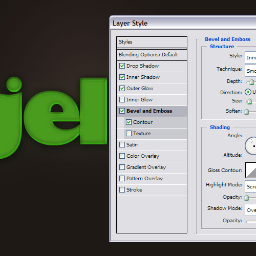
To create the highlights, we use Bevel and Emboss. The default settings for bevel and emboss suck, so don't use those. I've moved some things around and if you download the sample PSD, you'll see what I mean. The highlights need to be shades of green to make it look like light is bouncing around inside the letters.
Step 5:
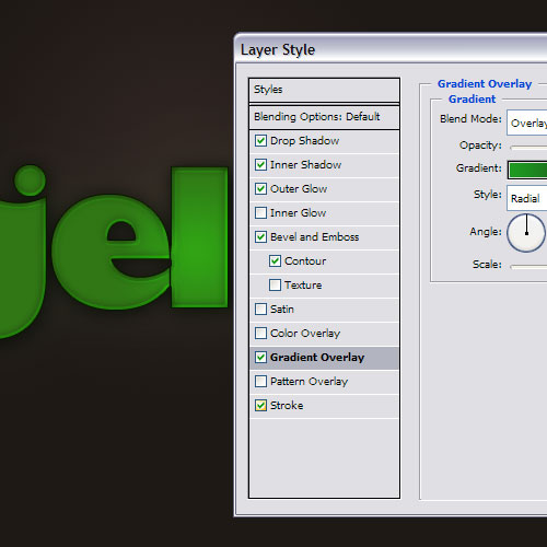
Next we add a Gradient Overlay and a Stroke. The gradient gives a bit of light and dark to the letters and the stroke helps seal it off at the edges.
Step 6:
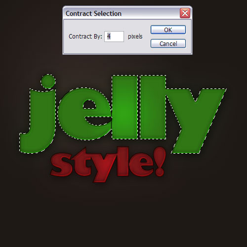
Now the neat thing about this style is you can just change the coloring on each set of blending options and you have a new color for the style. Here I've written a second word and applied the style there too but this time with red settings.

Step 7:
To finish it off, create a new layer above and then hold down Ctrl and click on the layer to select it.

Step 8:
Then go to Select > Modify > Contract and use a value of 4 pixels to shrink the selection.
Step 9:
Now we need a gradient that goes from white to transparency which you can choose by switching to the gradient tool and using the little thumbnail thing up at the top left (shown in the image)
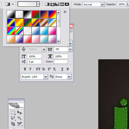
Step 10:
Using that gradient, draw a gradient in the selection from white to transparency.

Step 11:
Then make an elliptical selection using the selection tool and hit delete as shown. This will make the highlight you just drew suddenly stop and consequently look very plasticky.

Step 12:
And that's it! I've repeated the same highlight steps on the word 'Style' as well.

No comments:
Post a Comment