Step 1:
BACKGROUND LAYER
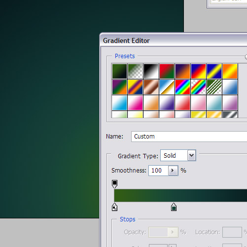
To begin this tutorial, we'll first give ourselves a nice background gradient. Now while most gradients are two-color, in Photoshop you can actually make much more complex gradients by clicking on the Gradient icon in the top left. You'll get a panel showing the gradient and you can add more colors to it. In this case, I've used three colors to make a gradual change from green to a set of blues.
Multi-color gradients can make for a stunning background. I've used a Radial Gradient and centered it to the bottom right.
The colors I've used are:
Color 1 - #2e5b15
Color 2 - #103533
Color 3 - #090e13
Step 2:
Now we need a letter. I've used the letter Q because it's my favorite, particularly in this serifed style. This is from the font Adobe Caslon Pro which I suspect came with my Photoshop install--although who knows, I have way to many fonts to remember! Give your letter a nice blue- green color. I've used #41a993.

Step 3:
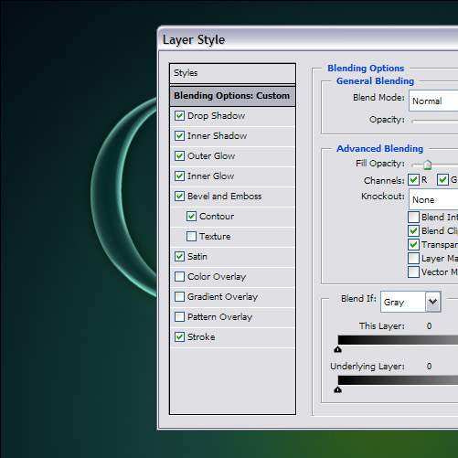
Now after this, I basically went through all the different types of layer styles and just experimented with them all. You can produce some really wicked combinations with a bit of trying out. The main things I did here were:
- Decrease Fill Opacity to 20%. Fill Opacity makes the layer transparent WITHOUT making the styles transparent. Note that this is DIFFERENT to Opacity which just makes everything see-through.
- Another thing I did was to try changing angles around, using different blending modes, and building the layers up slowly.
In any case, you can see all the exact settings by downloading the sample PSD file from the link on the top right. You can then right click that layer and hit Copy Layer Styles if you just want to paste it into your own file.
Step 4:
So here is the result of my layer styles. It's a pretty cool-looking style.
Note that I've made it look as if the light is coming from the bottom. This matches the direction of my gradient and gives a convincing look. I've then also used a fainter set of highlights coming from the other side. This vaguely matches how glass sometimes reflects light about.

Step 5:
Now hold down Ctrl and click on the Q layer to select the shape and add a white to transparent gradient coming from the bottom into a NEW layer.
You can do color to transparent gradients by clicking on the Gradient Tool in the top left and holding it down to see the whole set of gradients (as we did earlier in this tutorial). The second one along is color to transparency. It's SUCH a useful gradient. Great for this sort of glass/plastic effects in particular.
Now fade this back by changing its blend mode to Overlay.

Step 6:
Now again hold Ctrl and select the Q layer. In a new layer, again add a radial white to transparent gradient, this time coming from the top down as shown.
Fade this one out by setting its opacity to 40%.

Step 7:
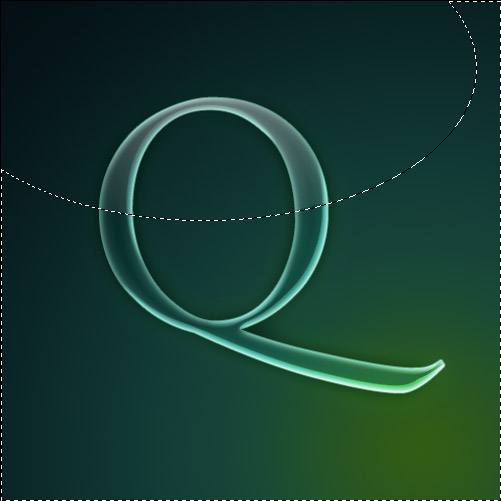
Now on the same layer as in the last step, draw an ellipse with the Selection Tool and hit Ctrl+Shift+I to select the inverse. Then hit delete to remove some of that gradient that we just drew.
Basically this makes the white suddenly stop and gives us a glassy feel. Try cutting in different ways to see the different sort of effects you can make.
Step 8:
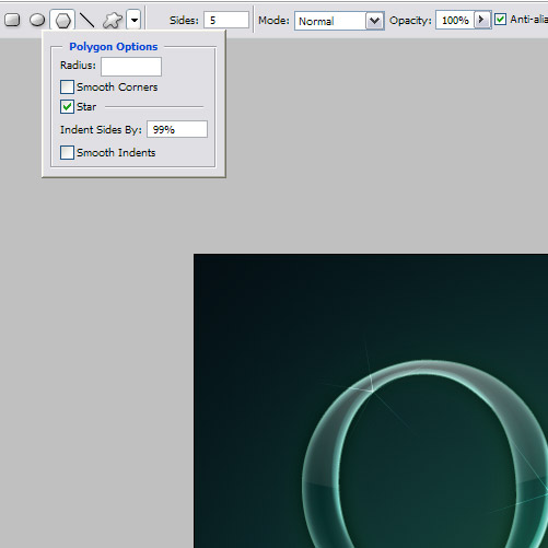
Now glass shines, so lets add some highlights to make it look really shiny. You can do this by choosing the Custom Shape Tool (U) and then in the top left click on Polygon and then on the down arrow to get options as shown. Tick Star and make sure your indent is set to 99% to make some nice little 5 pointed stars.
Now in a new layer with white as your foreground color, just add some highlighted stars liberally about. It's best to place them on the most highlighted parts of the Q to make it look like they are sparkles from those highlights.
Step 9:
And there you have the finished product: a glassy lettering style.

Sample PSD
Download the PSD for this tutorial
No comments:
Post a Comment