Step 1
Open up Illustrator and with the Type Tool, type some text. I used the font Bifurk, which is available to download for free. I used this font because nice thick fonts work best with this effect. Using a thin font usually yields poorer results. The font size has been set to 77pt. Don't worry about the font size too much. We'll be using Smart Objects, so we can adjust the size at any given time.

Step 2
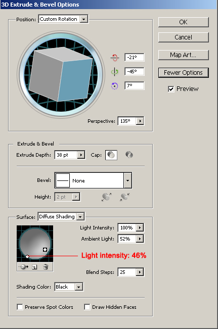
Now change the color to white. If you don't like not being able to see your text, you can simply use a different background. Next go to Effect>3D>Extrude & Bevel. Use the settings shown below, making sure to open up ore options, and make sure that Preview is on.
Step 3
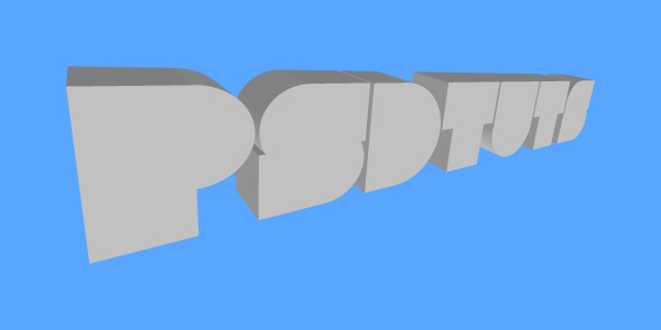
Time to migrate your work to Photoshop. Simply copy and paste the artwork (or drag it from one canvas to the other). I prefer to use Smart Objects. You can now resize your text to whatever size you want. In fact, the bigger the better. For the purposes of this tutorial, I will stick to a relatively small canvas. I placed the image on a blue background, so it's easier to work with than white on white.
Step 4
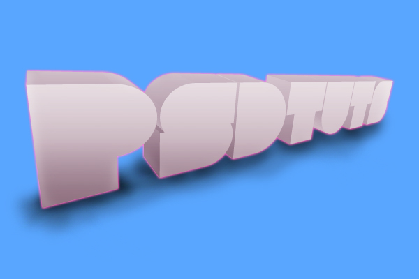
Now the magic happens! Use the Settings below to apply Layer Styles to the text. The result follows the settings images.

Step 5
Let's go over the top with this design. After all, this is a funky style we're creating here. Ctrl-Click your text layer to obtain a selection. Next, on a new layer add a smooth black to white gradient. Set the layer mode to Soft Light, and the Opacity to 40%. This creates some awesome contrast.
I also want to add some shadows so that my text sits on a surface. Select a low Opacity (around 20%) and a small-sized soft, black brush. Then brush a shadow below the text on a new lower layer. The further away you get from the text, the fewer strokes you should use. If you feel your shadow needs a blur then go to filter>blur>Gaussian blur. Use a value that seems appropriate to you. It's a basic shadow, nothing too fancy.
Step 6
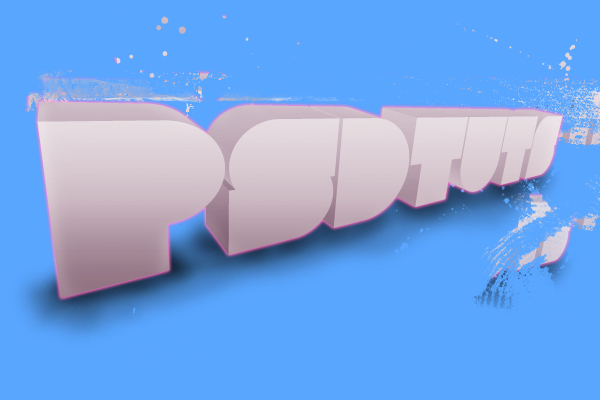
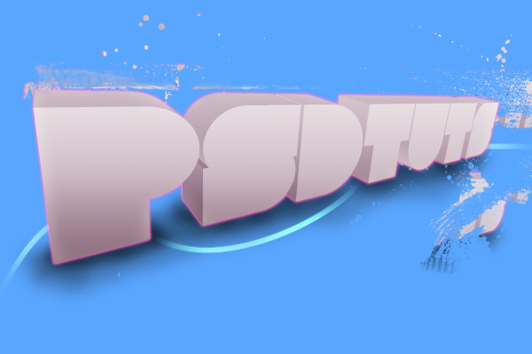
You could call it a day and stop here, or you could go on. Duplicate the smart object and rasterize it by going to (Layer > Rasterize > Smart Object). Hide the bottom smart object. Now go to the Clone Stamp Tool. Get a nice irregular brush, like a spatter brush, or something similar. Then clone some parts of the text. This creates a sweet broken-up effect. Be careful not to overdo the effect though.
Step 7
I'm going to add more elements. Instead of glowing swirls, I'm going to add what I like to call :road marks". Perhaps the proper term would be "pinstripes". I use the Pen Tool to create a shape that has the proper perspective (this is all by eye), and then I fill it with white. This enhances that illusion of a surface. You can tweak it with a mask and a low-opacity brush—fading some parts creates a sweet effect.
Step 8
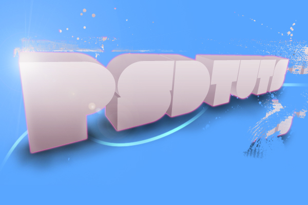
Lens flares are underestimated. When used well, they help to enhance the effect of a glowing object. Create a new layer on top of everything else, and fill it with black. Go to Filter > Render > Lens Flare. Go for the 105mm prime. Put it a tad off center, so you get a nice beam shooting out of it. Set the layer mode to screen. Perhaps you noticed that if you move the layer around, you can see a harsh edge at the end of the lens flare. Simply erase it with a soft eraser or mask it with a soft brush. You can regulate the layer's opacity in order to control the intensity of the effect.
Step 9
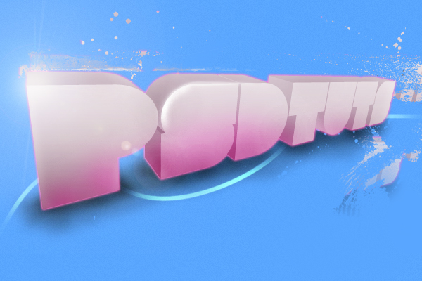
Let's add some color to the type now. Create a new layer on top of everything else. Grab a fuzzy, medium-sized brush, and set it to a color like (#e02c97). Start brushing the bottom of your type. When you are done, Ctrl-click on the layer where your type is located, so that a selection is visible around the type. Now hit the layer mask button at the bottom of the Layers palette. This should remove all the color that is outside the bounds of the text. Next, you should set this layer to soft light.
Step 10
Let's work some more on the background. Create a new document that is 40px by 2px. Make sure that the background is set to transparent. Now fill half of the document (20px) with black. Go to edit > define pattern. Then save this new pattern.

Step 11
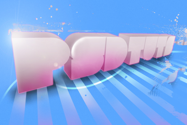
Return to your original project. On a new layer, located below your type layer, go to edit > fill. Set the use field to Pattern. From the patterns available, select your freshly made custom pattern from the previous step. Now hit OK. The whole canvas should fill with a bunch of stripes.
Now go to edit > transform > perspective. Take the lower-left anchor point, and while holding Shift, drag it outwards and to the left. Keep doing this until the stripes seem to match the orientation of the shadow. This adds to the 3D effect in the design.
Finally, I changed the layer mode to Soft Light. With a low-opacity brush and a mask, I added some texture to the whole thing. I also removed parts of the line patterns to focus the design with a mask.
Step 12
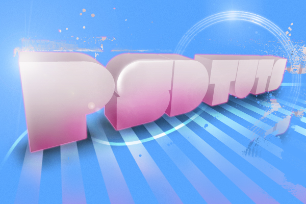
Next we'll create the rings. Take the Ellipse Tool and set it to paths instead of shape layers. Now make a nice circle (hold Shift to create a circle). Then stroke it with a 2px brush. Now you have one ring. Duplicate this layer, decrease it's size, and repeat this process about four more times. Now you have a bunch of rings. Merge all these layers. Then add a default glow, but with the color changed to white. Then add a lens flare on top, as we did earlier. For the fancy effect I used a mask (yes, again), and I got rid of a portion of the rings.
Step 13
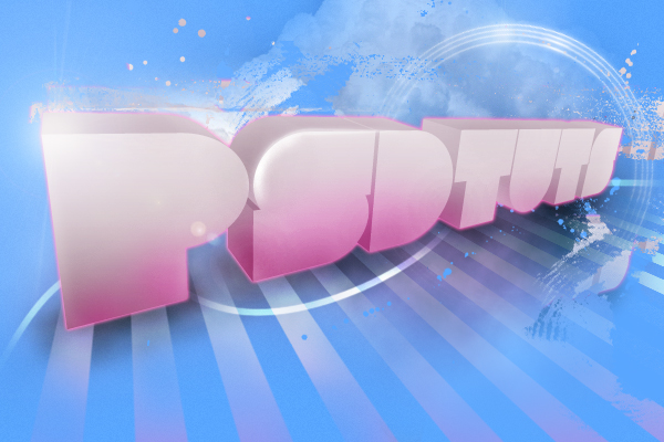
The next things to do are add the clouds and the 'smoke' below the letters. The clouds are from a stock image from Stock.Xchng. After downloading and importing the image, I heavily masked and duplicated it. Play around and see what happens. Every outcome is different with this one. The smoke was created with the same techniques as can be found at the beginning of the Flaming Meteor Text Effect tutorial by Fabio.
Conclusion
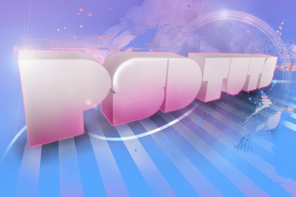
Add a new layer below our "Pinstripe" layer. Then create a pink gradient, which goes from top to bottom, and fades to transparent about halfway down. And we're done!
You've learned to create 3D style text without the use of advanced 3D software. There are many options available when creating a design like this. This kind of 3D text really looks great on posters or when blended into urban or nature scenery. Once learned, this technique can yield spectacular results. Enjoy!
No comments:
Post a Comment